When to use this
- You want UI Kit screens (lists, headers, and message UI) to match your brand colors and typography.
- You need to customize calling and AI UI components without rebuilding UI from scratch.
- You prefer centralized styling through
res/values/themes.xml. - You want consistent iconography by supplying your own vector drawables.
- You need a repeatable pattern that an AI coding agent can apply across components.
Prerequisites
- CometChat Android UI Kit v5 installed in your app.
- Your app theme extends
CometChatTheme.DayNight. - You can edit
res/values/themes.xmlin your Android module. - You can add drawable resources to
res/drawable/when needed. - You rebuild or sync Gradle after updating styles.
Quick start
- Open
res/values/themes.xml. - Create a custom style that extends the component’s parent style (for example,
CometChatConversationsStyle). - Assign your custom style to
AppThemeusing the component’s theme attribute (for example,cometchatConversationsStyle). - Sync Gradle and rebuild the app.
- Navigate to the screen that uses the component and confirm the visual change.
res/values/themes.xml
- What this does: applies a custom avatar style to the Conversations list through your app theme.
- Verify: open the Conversations screen and confirm the avatar background and stroke radius changed.
Core concepts
AppThemeis the single place where UI Kit style hooks are wired.- Each UI Kit component has a parent style (for example,
CometChatMessageListStyle) and a theme attribute (for example,cometchatMessageListStyle). - Custom styles must extend the correct parent style to inherit default behavior.
- Drawable overrides (for example, custom icons) live in
res/drawable/and are referenced from styles. - Fonts can be set once at the theme level and reused across components.
res/values/themes.xml
- What this does: sets UI Kit typography once so you do not repeat font assignments in every component.
Implementation
Use the following sections to style each component. Each section lists what changes, where to change it, the exact code to paste, and how to verify the result.Chat lists and messaging UI
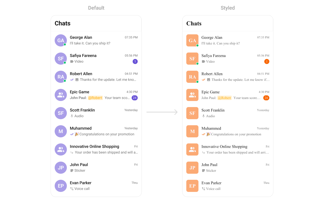
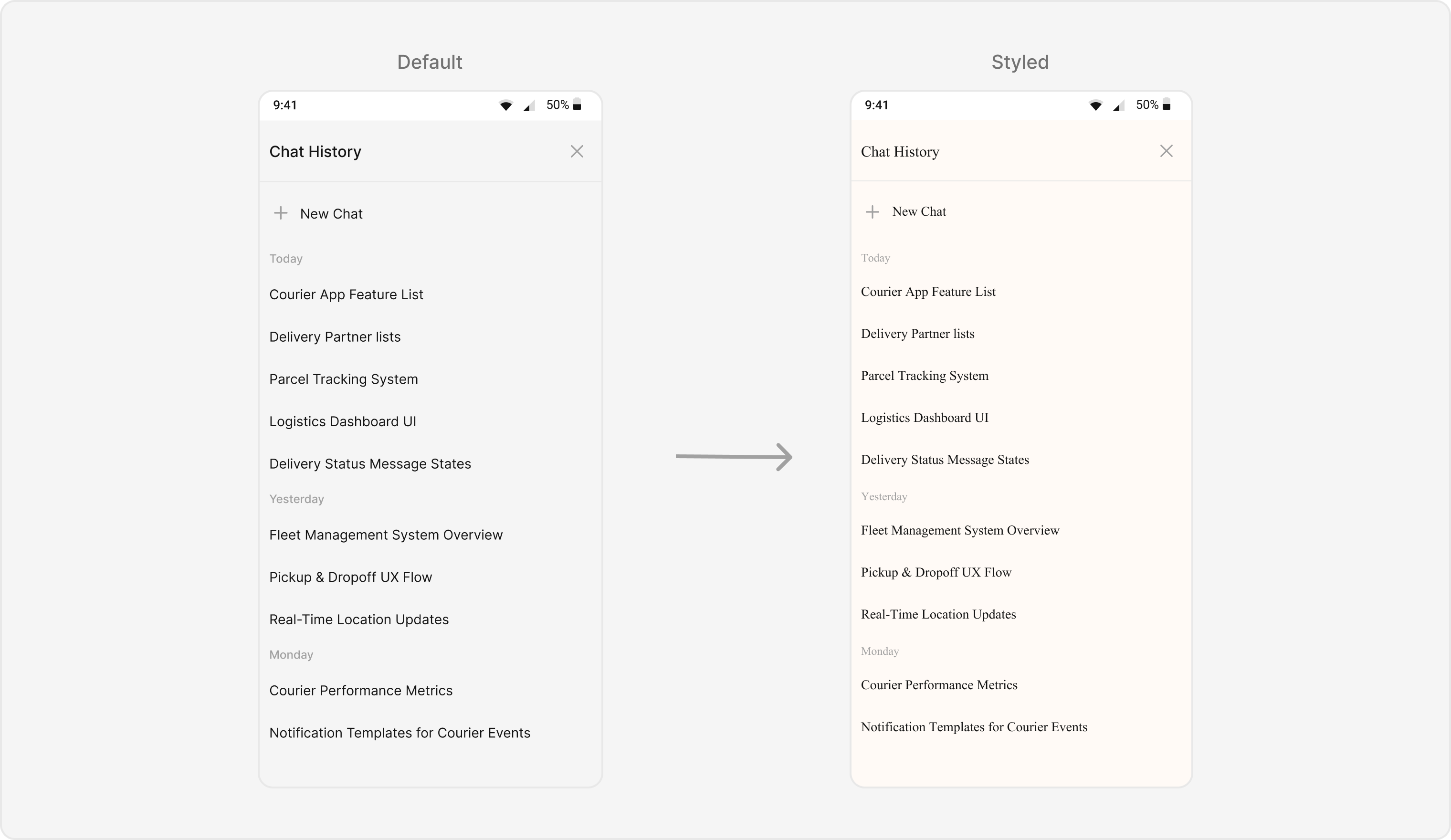
Conversations
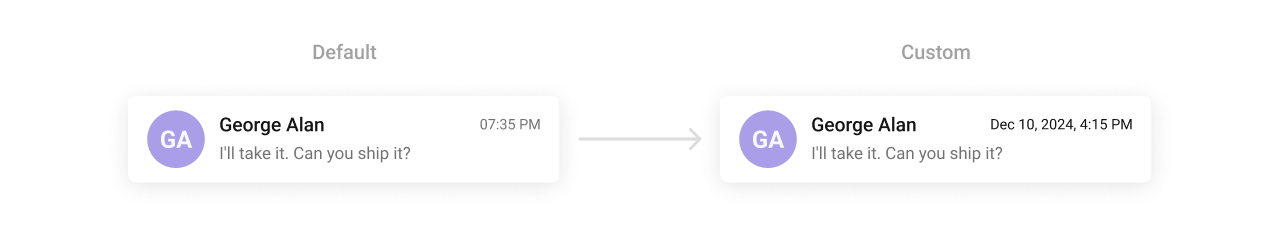
TheCometChatConversations component renders the recent chats list.
-
Where to change it:
res/values/themes.xml -
Applies to:
CometChatConversations - Default behavior: UI Kit default avatar and badge styles.
-
Override: set
cometchatConversationsStyleinAppTheme. - Code:
res/values/themes.xml
- What this does: applies custom avatar and badge styles to conversation list items.
- Verify: the Conversations list shows updated avatar backgrounds and badge colors.
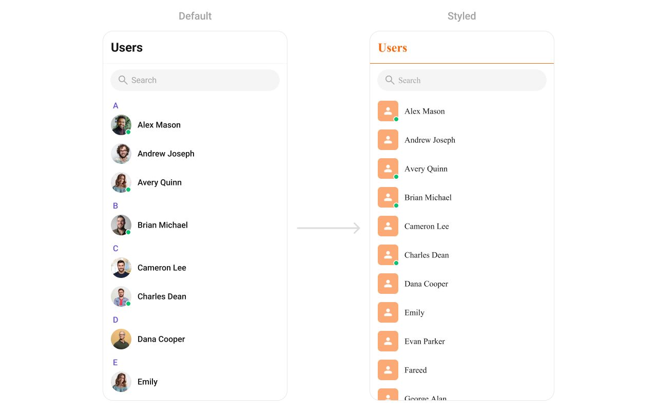
Users
TheCometChatUsers component renders a list of users for selection or navigation.
-
Where to change it:
res/values/themes.xml -
Applies to:
CometChatUsers - Default behavior: UI Kit default avatar and list styling.
-
Override: set
cometchatUsersStyleinAppTheme. - Code:
res/values/themes.xml
- What this does: applies avatar and separator color overrides to the user list.
- Verify: the Users list shows updated avatar backgrounds and separator color.
Groups
TheCometChatGroups component renders group items and their summary data.

-
Where to change it:
res/values/themes.xml -
Applies to:
CometChatGroups - Default behavior: UI Kit default group item styling.
-
Override: set
cometchatGroupsStyleinAppTheme. - Code:
res/values/themes.xml
- What this does: styles group avatars and separators in the Groups list.
- Verify: the Groups list shows the updated avatar background and title color.
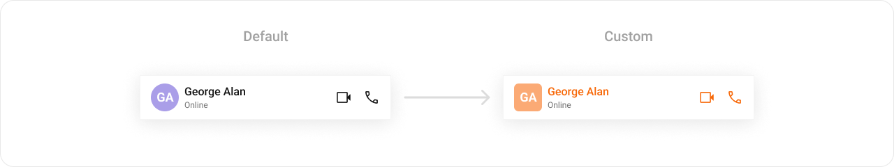
Message Header
TheCometChatMessageHeader component renders the title, avatar, and action icons for a chat.
-
Where to change it:
res/values/themes.xml -
Applies to:
CometChatMessageHeader - Default behavior: UI Kit default header typography and icons.
-
Override: set
cometchatMessageHeaderStyleinAppTheme. - Code:
res/values/themes.xml
- What this does: applies custom title color, avatar styling, and call button tints in the message header.
- Verify: open a conversation and check the header text and call button icons.
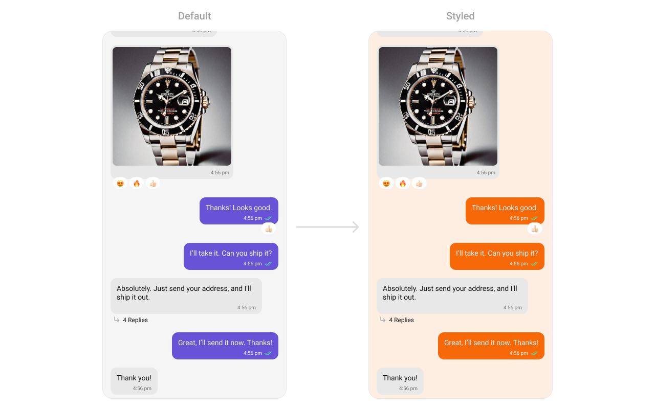
Message List
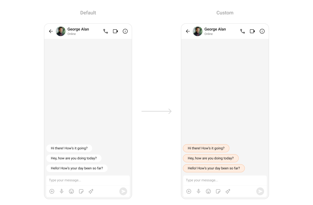
TheCometChatMessageList component renders conversation messages and their bubble styles.
-
Where to change it:
res/values/themes.xml -
Applies to:
CometChatMessageList - Default behavior: UI Kit default message list background and bubble colors.
-
Override: set
cometchatMessageListStyleinAppTheme. - Code:
res/values/themes.xml
- What this does: changes the message list background and outgoing bubble color.
- Verify: open a conversation and check outgoing message bubble colors.
Message Composer
TheCometChatMessageComposer component renders the input box and action buttons.
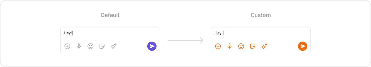
-
Where to change it:
res/drawable/active_send_button.xmlandres/values/themes.xml -
Applies to:
CometChatMessageComposer - Default behavior: UI Kit default composer icons and send button drawable.
-
Override: set
cometchatMessageComposerStyleinAppThemeand reference a custom drawable. - Code:
res/drawable/active_send_button.xml
- What this does: defines a custom circular send button drawable.
- Code:
res/values/themes.xml
- What this does: applies custom icon tints and the active send button drawable to the composer.
- Verify: the composer shows the custom send button and tinted icons.
Group Members
TheCometChatGroupMembers component lists users inside a group.

-
Where to change it:
res/values/themes.xml -
Applies to:
CometChatGroupMembers - Default behavior: UI Kit default list styling.
-
Override: set
cometchatGroupMembersStyleinAppTheme. - Code:
res/values/themes.xml
- What this does: applies custom avatar and separator styling to the group members list.
- Verify: the group members screen shows updated avatar and separator colors.
Thread Header
TheCometChatThreadHeader component renders the parent message preview in threaded views.
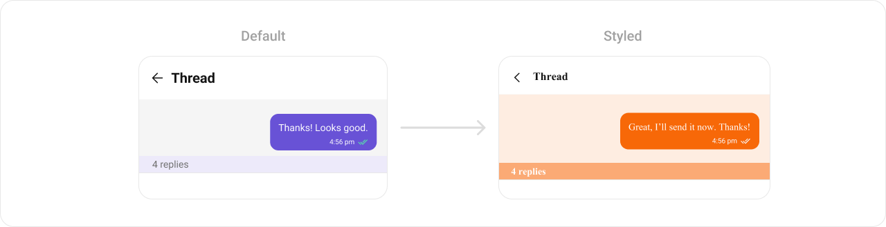
-
Where to change it:
res/values/themes.xml -
Applies to:
CometChatThreadHeader - Default behavior: UI Kit default thread header styling.
-
Override: set
cometchatThreadHeaderStyleinAppTheme. - Code:
res/values/themes.xml
- What this does: customizes thread header bubble colors and reply count styling.
- Verify: open a thread and confirm the header background and reply count colors.
Search
TheCometChatSearch component provides cross-conversation and message search UI.
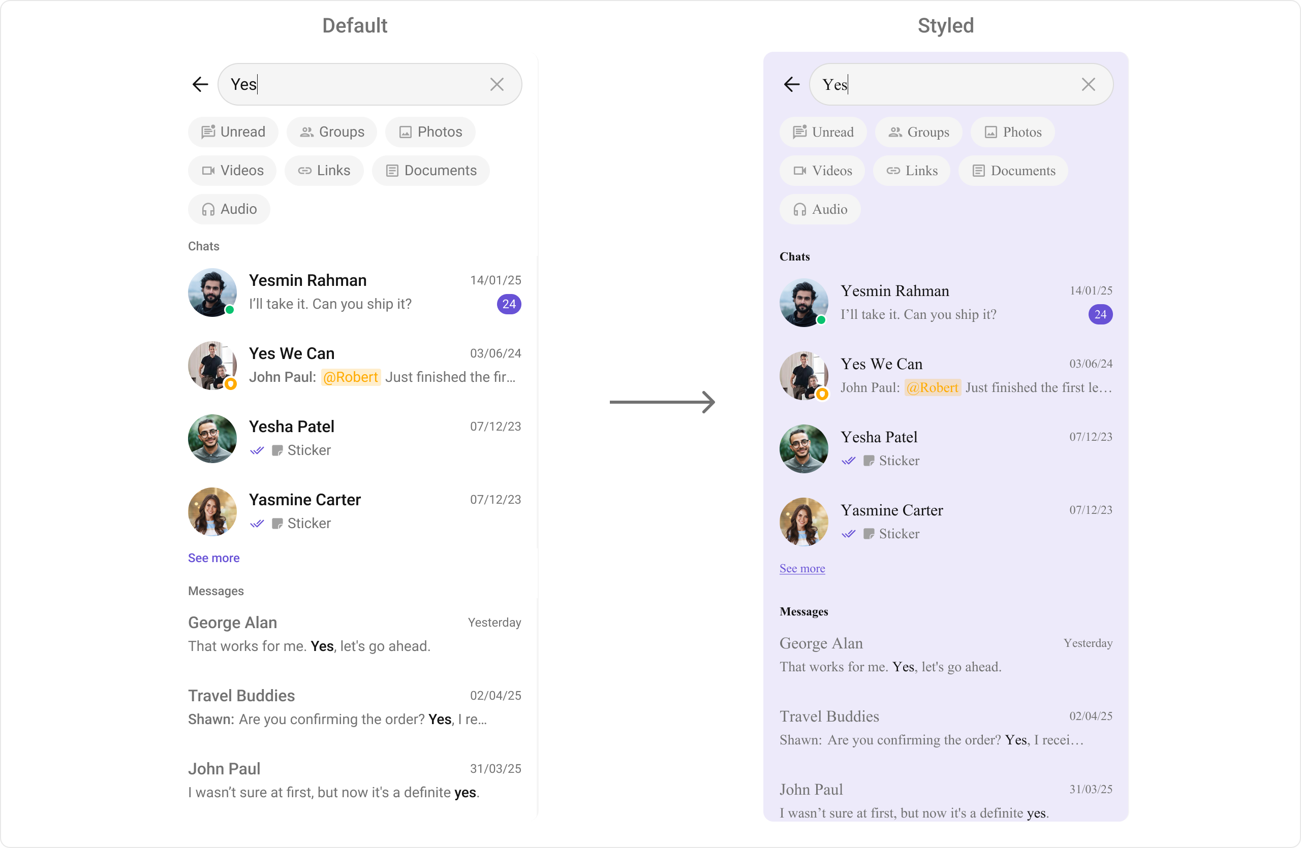
-
Where to change it:
res/values/themes.xml -
Applies to:
CometChatSearch - Default behavior: UI Kit default search colors and text appearance.
-
Override: set
cometchatSearchStyleinAppTheme. - Code:
res/values/themes.xml
- What this does: applies custom search colors and text styles across search UI sections.
- Verify: open Search and check section headers, chips, and list items.
Message Information
TheCometChatMessageInformation component displays message metadata such as delivery and read status.
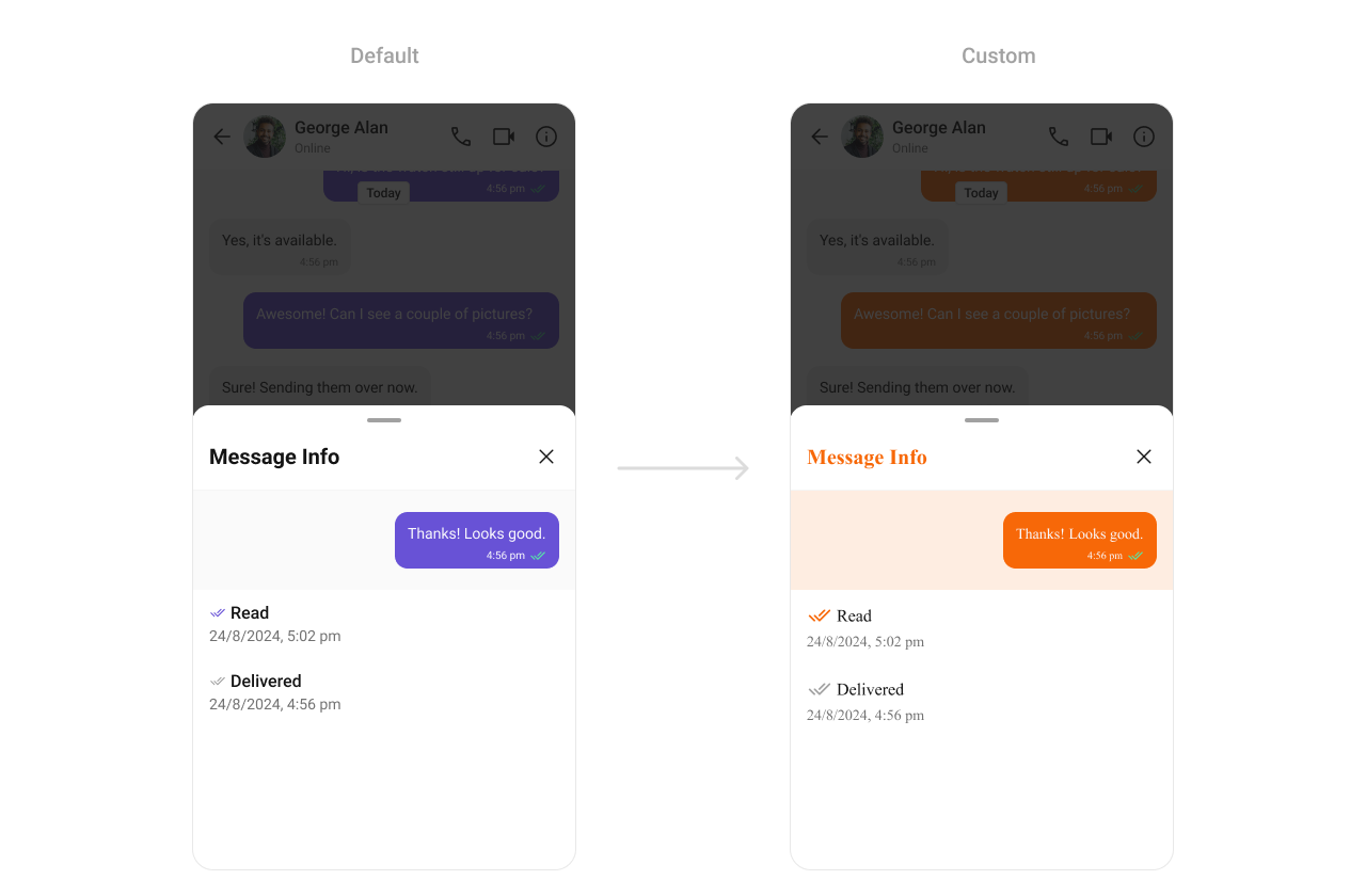
-
Where to change it:
res/values/themes.xml -
Applies to:
CometChatMessageInformation - Default behavior: UI Kit default metadata styling.
-
Override: set
cometchatMessageInformationStyleinAppTheme. - Code:
res/values/themes.xml
- What this does: wires a custom Message Information style so you can override specific metadata attributes.
- Verify: open Message Information and confirm your overrides apply.
Message Option Sheet
TheCometChatMessageOptionSheet component is the action menu for message-level actions.

-
Where to change it:
res/values/themes.xml -
Applies to:
CometChatMessageOptionSheet - Default behavior: UI Kit default option sheet styling.
-
Override: set
cometchatMessageOptionSheetStyleinAppTheme. - Code:
res/values/themes.xml
- What this does: updates message option sheet icon tint and background color.
- Verify: long-press a message and confirm the option sheet styling.
Attachment Option Sheet
TheCometChatAttachmentOptionSheet component renders the attachment picker.
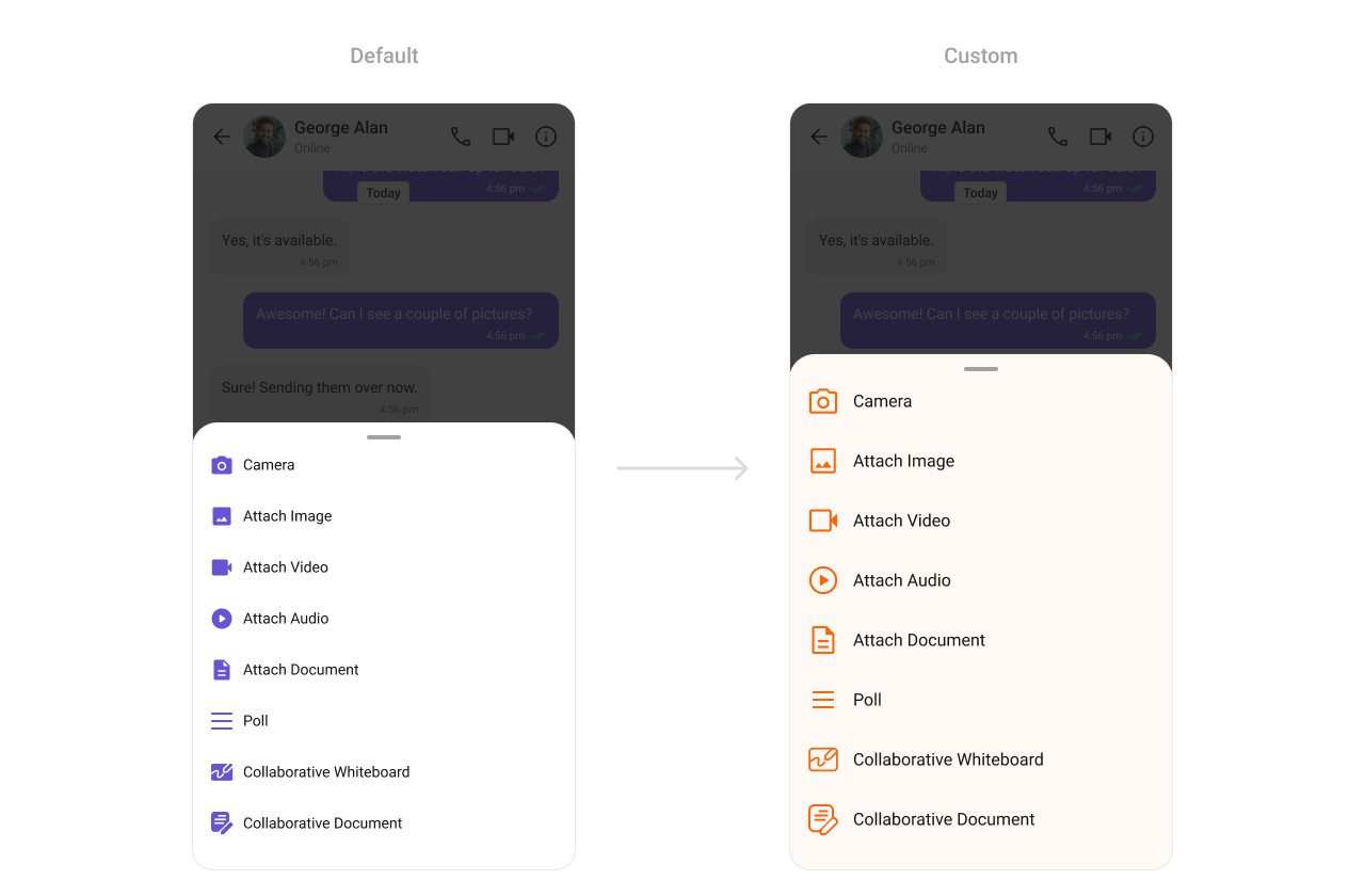
-
Where to change it:
res/values/themes.xml -
Applies to:
CometChatAttachmentOptionSheet - Default behavior: UI Kit default attachment sheet styling.
-
Override: set
cometchatAttachmentOptionSheetStyleinAppTheme. - Code:
res/values/themes.xml
- What this does: applies custom colors to the attachment picker sheet.
- Verify: open the attachment menu and confirm background and icons.
Mentions
TheCometChatMentions styling controls how user mentions appear inside messages.
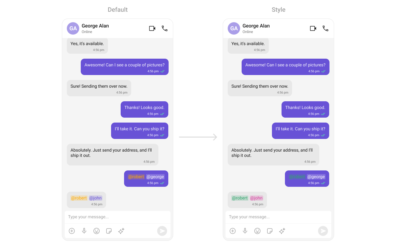
-
Where to change it:
res/values/themes.xml -
Applies to:
CometChatMentions - Default behavior: UI Kit default mention styling.
-
Override: set
cometchatMessageBubbleMentionsStylein both incoming and outgoing bubble styles. - Code:
res/values/themes.xml
- What this does: customizes mention colors for incoming and outgoing message bubbles.
- Verify: send a mention in a chat and check the mention highlight colors.
Calling UI
Call Logs
TheCometChatCallLogs component renders recent call history.
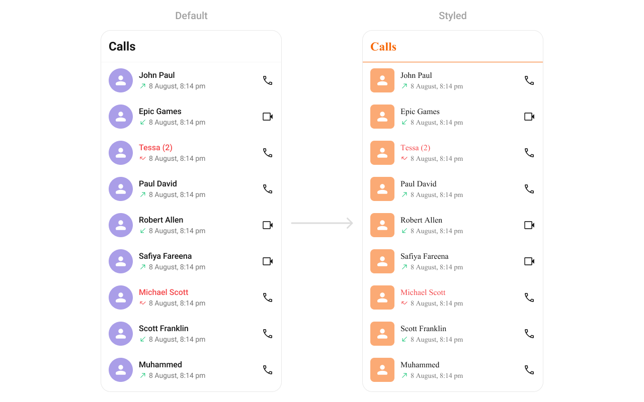
-
Where to change it:
res/values/themes.xml -
Applies to:
CometChatCallLogs - Default behavior: UI Kit default call log styling.
-
Override: set
cometchatCallLogsStyleinAppTheme. - Code:
res/values/themes.xml
- What this does: applies custom avatar and text colors to the call logs list.
- Verify: open Call Logs and confirm the separator and title colors.
Incoming Call
TheCometChatIncomingCall component renders the incoming call UI.
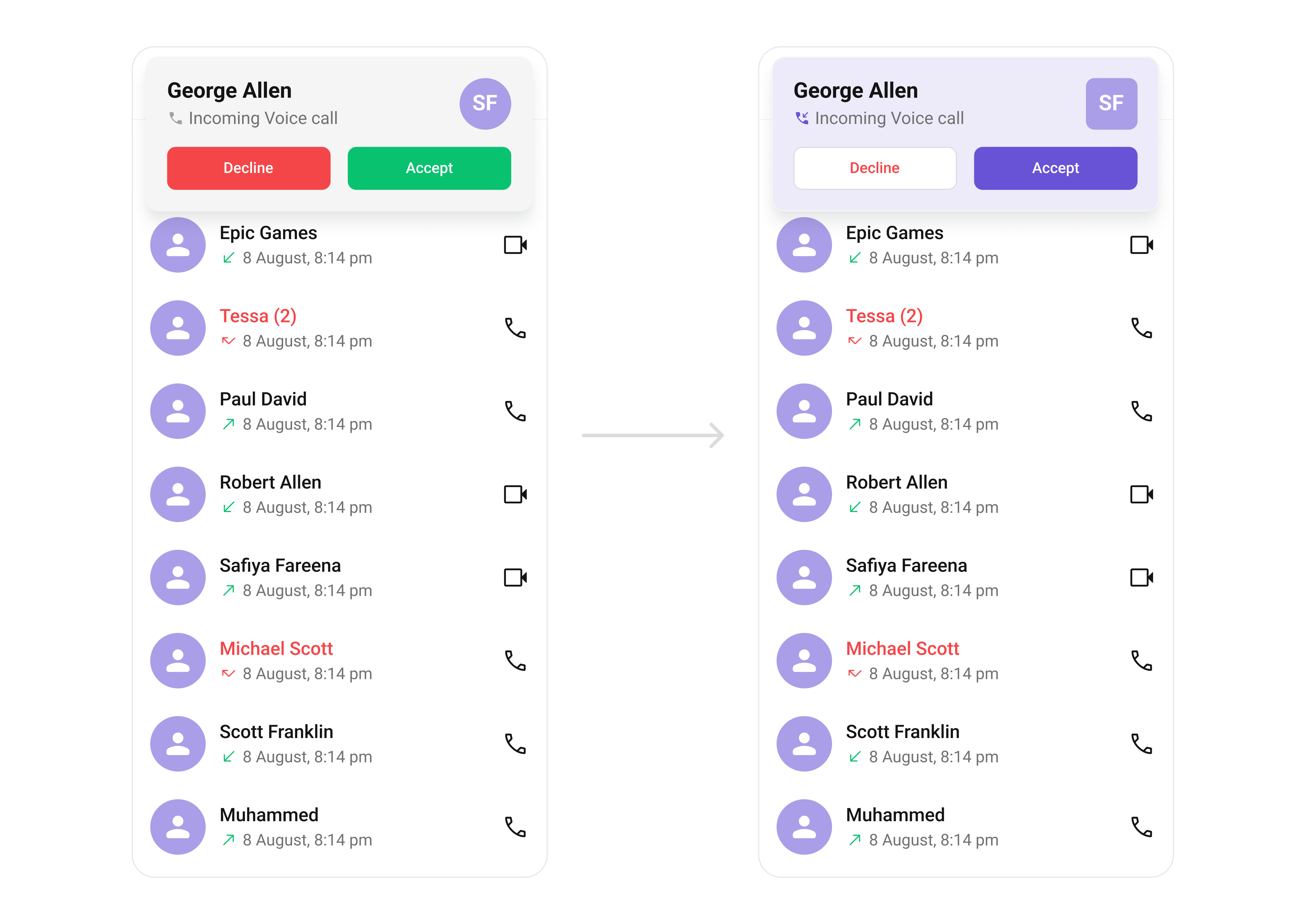
-
Where to change it:
res/values/themes.xml -
Applies to:
CometChatIncomingCall - Default behavior: UI Kit default incoming call layout and colors.
-
Override: set
cometchatIncomingCallStyleinAppTheme. - Code:
res/values/themes.xml
- What this does: customizes the incoming call screen background and action buttons.
- Verify: trigger an incoming call and confirm the background and button colors.
Outgoing Call
TheCometChatOutgoingCall component renders the outgoing call UI.

-
Where to change it:
res/values/themes.xml -
Applies to:
CometChatOutgoingCall - Default behavior: UI Kit default outgoing call styling.
-
Override: set
cometchatOutgoingCallStyleinAppTheme. - Code:
res/values/themes.xml
- What this does: applies a custom avatar style to the outgoing call screen.
- Verify: place a call and confirm the avatar styling.
Call Buttons
TheCometChatCallButton component renders voice and video call buttons.

-
Where to change it:
res/values/themes.xml -
Applies to:
CometChatCallButtons - Default behavior: UI Kit default call button styling.
-
Override: set
cometchatCallButtonsStyleinAppTheme. - Code:
res/values/themes.xml
- What this does: customizes call button padding, background, and icon colors.
- Verify: open a chat header and confirm button styling.
AI UI
AI Assistant Chat History
TheCometChatAIAssistantChatHistory component renders the AI conversation history view.
-
Where to change it:
res/values/themes.xml -
Applies to:
CometChatAIAssistantChatHistory - Default behavior: UI Kit default AI history styling.
-
Override: set
cometChatAIAssistantChatHistoryStyleinAppTheme. - Code:
res/values/themes.xml
- What this does: applies custom colors and font styling to the AI Assistant history screen.
- Verify: open AI Assistant history and confirm background and header styling.
AI Option Sheet
TheCometChatAIOptionSheet component renders AI action options.

-
Where to change it:
res/values/themes.xml -
Applies to:
CometChatAIOptionSheet - Default behavior: UI Kit default AI option sheet styling.
-
Override: set
cometchatAIOptionSheetStyleinAppTheme. - Code:
res/values/themes.xml
- What this does: customizes AI option sheet colors.
- Verify: open AI actions and confirm the option sheet styling.
Conversation Starter
TheCometChatConversationStarter component renders AI-powered conversation starters.
-
Where to change it:
res/values/themes.xml -
Applies to:
CometChatConversationStarter - Default behavior: UI Kit default conversation starter styling.
-
Override: set
cometchatAIConversationStarterStyleinAppTheme. - Code:
res/values/themes.xml
- What this does: applies a custom background color to AI conversation starter items.
- Verify: open a new chat and confirm the conversation starter chip color.
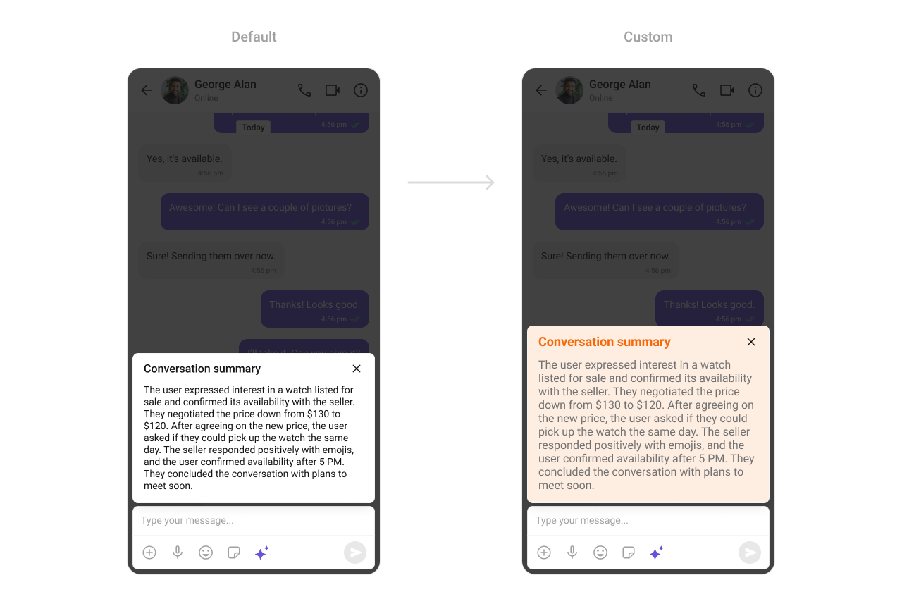
Conversation Summary
TheCometChatConversationSummary component renders AI-generated summaries of chats.
-
Where to change it:
res/values/themes.xml -
Applies to:
CometChatConversationSummary - Default behavior: UI Kit default conversation summary styling.
-
Override: set
cometchatAIConversationSummaryStyleinAppTheme. - Code:
res/values/themes.xml
- What this does: applies a custom background color to conversation summary cards.
- Verify: open a chat summary and confirm the background color.
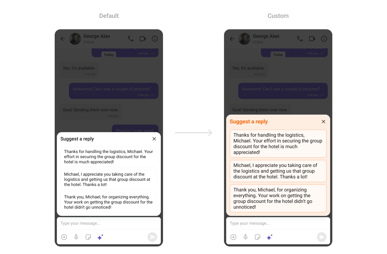
Smart Replies
TheCometChatSmartReplies component renders AI-generated reply suggestions.
-
Where to change it:
res/values/themes.xml -
Applies to:
CometChatSmartReplies - Default behavior: UI Kit default smart replies styling.
-
Override: set
cometchatAISmartRepliesStyleinAppTheme. - Code:
res/values/themes.xml
- What this does: customizes smart reply container and chip styling.
- Verify: open a conversation with smart replies enabled and confirm chip styling.
Base components
Avatar
TheCometChatAvatar component is used across lists and headers.
-
Where to change it:
res/values/themes.xml -
Applies to:
CometChatAvatar - Default behavior: UI Kit default avatar styling.
-
Override: set
cometchatAvatarStyleinAppTheme. - Code:
res/values/themes.xml
- What this does: applies a consistent avatar style across UI Kit components.
- Verify: open any list with avatars and confirm the style.
Status Indicator
TheCometChatStatusIndicator component shows user presence status.

-
Where to change it:
res/drawable/online_indicator_drawable.xmlandres/values/themes.xml -
Applies to:
CometChatStatusIndicator - Default behavior: UI Kit default presence icon.
-
Override: set
cometchatStatusIndicatorStyleinAppThemeand reference a custom drawable. - Code:
res/drawable/online_indicator_drawable.xml
- What this does: defines a custom online indicator drawable.
- Code:
res/values/themes.xml
- What this does: applies the custom status indicator drawable in UI Kit components.
- Verify: check any user list to confirm the presence icon.
Badge
TheCometChatBadge component shows unread or notification counts.
-
Where to change it:
res/values/themes.xml -
Applies to:
CometChatBadge - Default behavior: UI Kit default badge styling.
-
Override: set
cometchatBadgeStyleinAppTheme. - Code:
res/values/themes.xml
- What this does: applies a custom badge appearance across UI Kit lists.
- Verify: check any unread badge to confirm colors and radius.
Date
TheCometChatDate component formats timestamps in lists and message threads.
-
Where to change it:
res/values/themes.xml -
Applies to:
CometChatDate - Default behavior: UI Kit default date styling.
-
Override: set
cometchatDateStyleinAppTheme. - Code:
res/values/themes.xml
- What this does: customizes date text color in UI Kit lists and headers.
- Verify: check any timestamp and confirm the color.
Receipts
TheCometChatReceipts component renders read and delivered status icons.

-
Where to change it:
res/drawable/read_receipts.xmlandres/values/themes.xml -
Applies to:
CometChatReceipts - Default behavior: UI Kit default receipt icons.
-
Override: set
cometchatMessageReceiptStyleinAppThemeand reference a custom drawable. - Code:
res/drawable/read_receipts.xml
- What this does: defines a custom read receipt icon.
- Code:
res/values/themes.xml
- What this does: applies the custom receipt icon to message status indicators.
- Verify: send a message and check the receipt icon for read status.
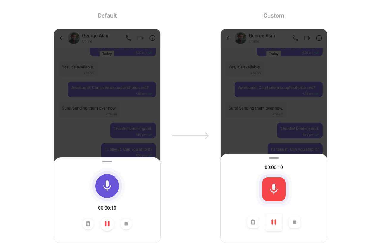
Media Recorder
TheCometChatMediaRecorder component controls audio and video message recording.
-
Where to change it:
res/values/themes.xml -
Applies to:
CometChatMediaRecorder - Default behavior: UI Kit default media recorder styling.
-
Override: set
cometchatMediaRecorderStyleinAppTheme. - Code:
res/values/themes.xml
- What this does: applies custom sizing and color to the media recorder UI.
- Verify: open the recorder and check icon sizes and record button color.
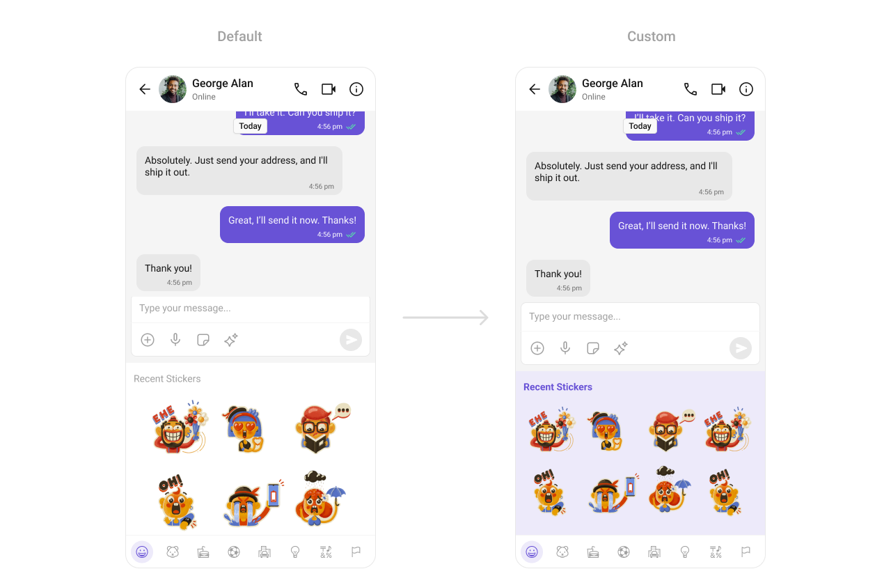
Sticker Keyboard
TheCometChatStickerKeyboard component renders the sticker picker UI.
-
Where to change it:
res/values/themes.xml -
Applies to:
CometChatStickerKeyboard - Default behavior: UI Kit default sticker keyboard styling.
-
Override: set
cometchatStickerKeyboardStyleinAppTheme. - Code:
res/values/themes.xml
- What this does: applies a custom background color to the sticker keyboard.
- Verify: open the sticker keyboard and confirm the background color.
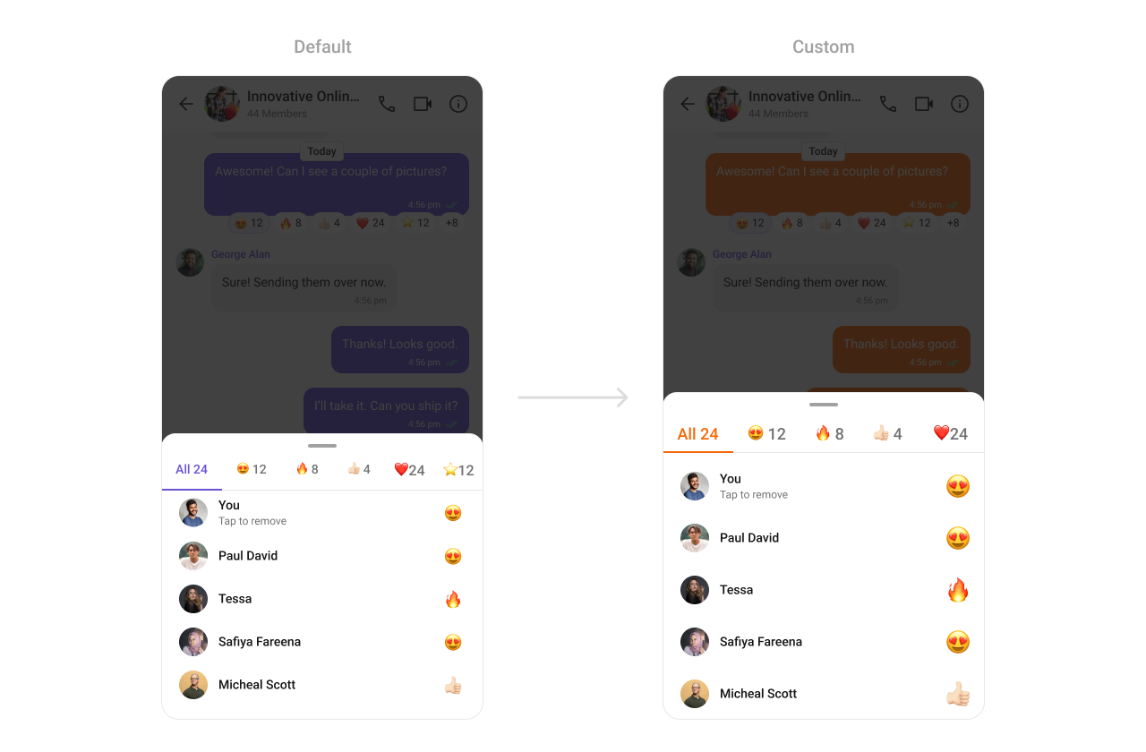
Reaction List
TheCometChatReactionList component renders reactions on messages.
-
Where to change it:
res/values/themes.xml -
Applies to:
CometChatReactionList - Default behavior: UI Kit default reaction list styling.
-
Override: set
cometchatReactionListStyleinAppTheme. - Code:
res/values/themes.xml
- What this does: applies a custom active tab color in the reaction list.
- Verify: open reactions and confirm the active tab color.
Customization matrix
| What you want to change | Where | Property or API | Example |
|---|---|---|---|
| Conversations avatar and badge | res/values/themes.xml | cometchatConversationsStyle | cometchatConversationsBadgeStyle |
| Users list separators | res/values/themes.xml | cometchatUsersStyle | cometchatUsersSeparatorColor |
| Group list titles | res/values/themes.xml | cometchatGroupsStyle | cometchatGroupsTitleTextColor |
| Header call icons | res/values/themes.xml | cometchatMessageHeaderStyle | cometchatMessageHeaderCallButtonsStyle |
| Message list background | res/values/themes.xml | cometchatMessageListStyle | cometchatMessageListBackgroundColor |
| Composer send button | res/drawable/active_send_button.xml | cometchatMessageComposerActiveSendButtonDrawable | @drawable/active_send_button |
| Search UI typography | res/values/themes.xml | cometchatSearchStyle | cometchatSearchBarTextAppearance |
| Call buttons styling | res/values/themes.xml | cometchatCallButtonsStyle | cometchatCallButtonsVideoCallBackgroundColor |
| AI smart replies chip style | res/values/themes.xml | cometchatAISmartRepliesStyle | cometchatAISmartRepliesItemStrokeColor |
| Mentions highlight colors | res/values/themes.xml | cometchatMessageBubbleMentionsStyle | cometchatMentionTextColor |
Common pitfalls and fixes
- Issue: styles do not apply. Fix: confirm your activity theme is
AppThemeand extendsCometChatTheme.DayNight. - Issue: only some screens update. Fix: the screen might use a different theme; verify the theme in your activity or fragment.
- Issue: drawable changes not visible. Fix: rebuild the app after adding a new drawable file.
- Issue: changes apply in light mode but not dark mode. Fix: update both
values/themes.xmlandvalues-night/themes.xmlif you use night resources. - Issue: attribute name not recognized. Fix: confirm the exact attribute name in the linked attribute reference file.
- Issue: style overridden unexpectedly. Fix: check for duplicate style names in other modules or flavors.
- Issue: colors look wrong on some devices. Fix: verify color hex values include alpha when needed.
- Issue: list items still show default fonts. Fix: set UI Kit fonts in
AppThemeonce as shown in Core concepts.
FAQ
Q: Do I need to repeat font settings in every component style?A: No. Set fonts once in
AppTheme using cometchatFontBold, cometchatFontMedium, and cometchatFontRegular.
Q: Where do I find all available attributes for a component?A: Use the Attribute references links under each component section. Q: Why do my changes not appear in a specific screen?
A: Confirm the screen is using the same
AppTheme and not overriding the theme locally.
Q: Can I change icons without changing the component layout?A: Yes. Provide a custom vector in
res/drawable/ and reference it from the component style.
Q: Do I need to enable anything in the CometChat Dashboard for styling?A: No. Styling is local to your Android project and does not require dashboard changes.