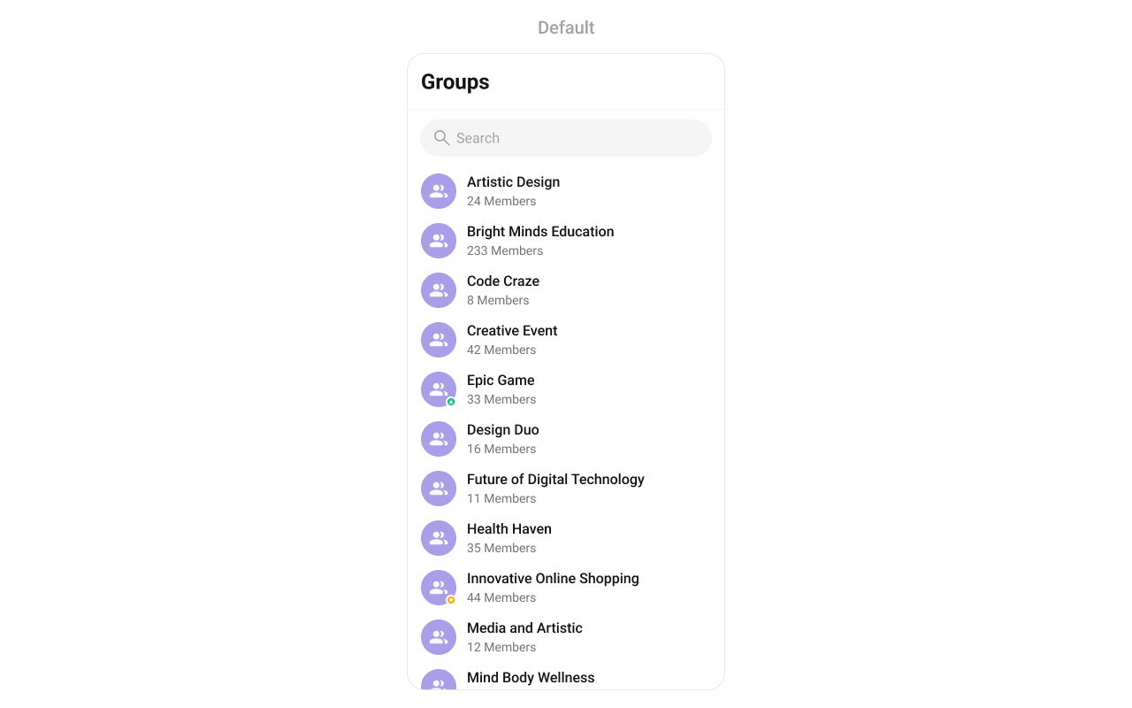
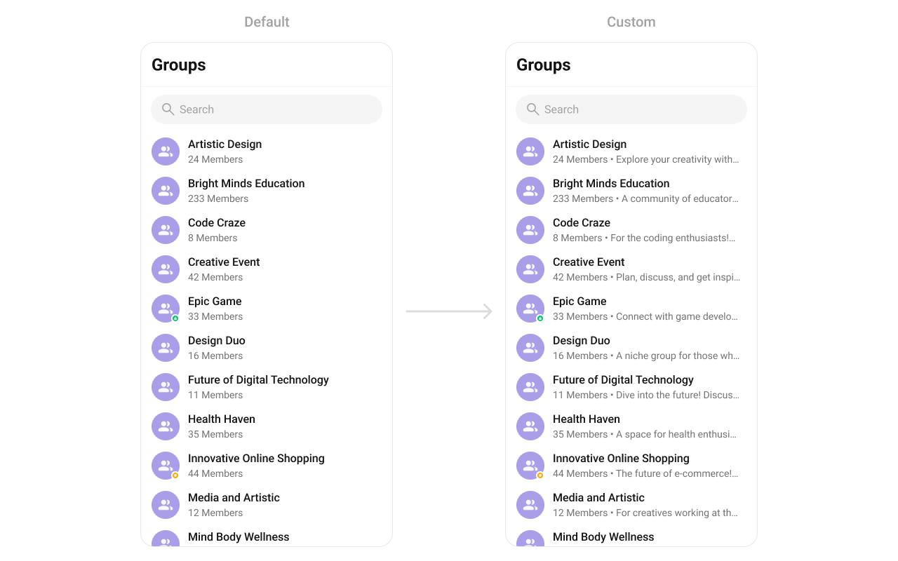
CometChatGroups displays a searchable list of groups, acting as a container component that encapsulates and formats CometChatListBase and CometChatGroupList.
When to use this
- You need a screen that lists all available groups for the logged-in user.
- You want to show group names, avatars, and group type indicators (public, private, password-protected).
- You need tap and long-press actions on group items (open group chat, mute, leave, delete).
- You want to filter groups by joined-only status, tags, or search keywords using
GroupsRequestBuilder. - You need real-time updates when groups are created, deleted, or membership changes occur.
- You want to customize the group list appearance with styles, custom views, or advanced view overrides.
Prerequisites
- CometChat SDK initialized with
CometChatUIKit.init()and a user logged in. - The
cometchat-chat-uikit-androiddependency added to your project. - A valid
layout_activity.xmlor Activity/Fragment where you will place the component.
Quick start
- Open your
layout_activity.xmlfile. - Add the
CometChatGroupsXML element:
layout_activity.xml
What this does: Adds the CometChatGroups component to your layout. It fills the available width and height and renders the group list for the logged-in user.
- Build and run your app.
- Verify that the group list appears with group names, avatars, and group type indicators.
- If you need to respond to group item taps, see the Actions subsection in Implementation.
Core concepts
CometChatGroups: The main component class that renders the group list. It encapsulatesCometChatListBaseandCometChatGroupListwithout introducing additional behavior.- Actions: Callbacks such as
setOnItemClick,setOnItemLongClick, andsetOnBackPressListenerthat let you respond to user interactions. - Filters: Use
GroupsRequest.GroupsRequestBuilderto filter groups by limit, search keyword, joined-only status, or tags. - Events: Global events emitted via
CometChatGroupEvents(e.g.,ccGroupCreated,ccGroupDeleted) that you can listen to from anywhere in your app. - Style: XML theme styles (parent
CometChatGroupsStyle) applied viasetStyle()to customize colors, fonts, and sub-component styles. - Advanced views: Methods like
setLeadingView,setTitleView,setTrailingView,setItemView, andsetSubTitleViewthat let you replace default UI elements with custom layouts.
Implementation
Actions
What you’re changing: How the component responds to user interactions such as taps, long-presses, back button, selection, errors, load completion, and empty states.- Where: Activity or Fragment where you hold a reference to
CometChatGroups(e.g.,cometchatGroups). - Applies to:
CometChatGroups. - Default behavior: Predefined actions execute automatically (e.g., tapping a group opens the group chat, pressing back navigates to the previous screen).
- Override: Call the corresponding setter method to replace the default behavior with your own logic.
setOnItemClick
Function invoked when a Group item is clicked, used to open a Group profile or chat screen.
- Java
- Kotlin
YourActivity.java
What this does: Replaces the default item-click behavior. When a user taps a group, your custom lambda executes instead of the built-in navigation.
setOnItemLongClick
Function executed when a Group item is long-pressed, allowing additional actions like delete or block.
- Java
- Kotlin
YourActivity.java
What this does: Replaces the default long-press behavior. When a user long-presses a group, your custom lambda executes.
setOnBackPressListener
Triggered when the user presses the back button in the app bar. By default, it navigates to the previous activity.
- Java
- Kotlin
YourActivity.java
What this does: Overrides the default back-press navigation. When the user taps the back button, your custom logic runs instead.
setOnSelect
Called when an item from the fetched list is selected, useful for multi-selection features.
- Java
- Kotlin
YourActivity.java
What this does: Registers a callback that fires when the user selects one or more groups. The callback receives the list of selected Group objects.
setOnError
Listens for any errors that occur in the Groups component. This does not change the component’s behavior.
- Java
- Kotlin
YourActivity.java
What this does: Registers an error listener. If the component encounters an error (e.g., network failure), your callback receives the CometChatException.
setOnLoad
Invoked when the list is successfully fetched and loaded, helping track component readiness.
- Java
- Kotlin
YourActivity.java
What this does: Registers a callback that fires after the group list is fetched and rendered. The callback receives the list of loaded Group objects.
setOnEmpty
Called when the list is empty, enabling custom handling such as showing a placeholder message.
- Java
- Kotlin
YourActivity.java
What this does: Registers a callback that fires when the group list has no items. Use this to show a custom empty-state message or trigger other logic.
- Verify: After setting an action callback, trigger the corresponding user interaction (tap, long-press, back, select) and confirm your custom logic executes instead of the default behavior.
Filters
What you’re changing: Which groups appear in the list.- Where: Activity or Fragment where you hold a reference to
CometChatGroups. - Applies to:
CometChatGroups. - Default behavior: All groups are fetched and displayed.
- Override: Create a
GroupsRequest.GroupsRequestBuilder, configure it, and pass it tosetGroupsRequestBuilder.
| Property | Description | Code |
|---|---|---|
| Limit | Configure the maximum number of groups to fetch in a single request, optimizing pagination for smoother navigation. | .setLimit(Int) |
| Search Keyword | Employed to retrieve groups that match the provided string, facilitating precise searches. | .setSearchKeyWord(String) |
| Joined Only | Exclusively fetches joined groups. | .joinedOnly(boolean) |
| Tags | Utilized to fetch groups containing the specified tags. | .setTags(List<String>) |
| With Tags | Utilized to retrieve groups with specific tags. | .withTags(boolean) |
- Code:
- Java
- Kotlin
What this does: Creates aGroupsRequestBuilderthat filters groups to show only joined groups with a limit of 10 per fetch. The builder is then applied to theCometChatGroupscomponent.
SearchRequestBuilder
TheSearchRequestBuilder uses GroupsRequestBuilder to filter and customize the search list based on available parameters. This keeps uniformity between the displayed Groups List and searched Group List.
- Java
- Kotlin
What this does: Creates aGroupsRequestBuilderconfigured for search with a limit of 10 results and a search keyword filter. The builder is applied to the search functionality of theCometChatGroupscomponent.
- Verify: The group list shows only joined groups (when using
joinedOnly(true)) and fetches at most 10 items per request.
Events
What you’re changing: How your app reacts to global events emitted by the Groups component.- Where: Any Activity, Fragment, or class where you want to listen for group events.
- Applies to:
CometChatGroupEvents. - Default behavior: No external listeners are registered. Events are emitted but not handled outside the component.
- Override: Add a listener using
CometChatGroupEvents.addGroupListenerand remove it when no longer needed usingCometChatGroupEvents.removeListeners.
| Events | Description |
|---|---|
ccGroupCreated() | This will get triggered when the logged in user creates a group |
ccGroupDeleted() | This will get triggered when the logged in user deletes a group |
ccGroupLeft() | This will get triggered when the logged in user leaves a group |
ccGroupMemberScopeChanged() | This will get triggered when the logged in user changes the scope of another group member |
ccGroupMemberBanned() | This will get triggered when the logged in user bans a group member from the group |
ccGroupMemberKicked() | This will get triggered when the logged in user kicks another group member from the group |
ccGroupMemberUnbanned() | This will get triggered when the logged in user unbans a user banned from the group |
ccGroupMemberJoined() | This will get triggered when the logged in user joins a group |
ccGroupMemberAdded() | This will get triggered when the logged in user add new members to the group |
ccOwnershipChanged | This will get triggered when the logged in user transfer the ownership of their group to some other member |
- Code:
- Java
- Kotlin
What this does: Registers a global event listener tagged withTo remove the listener:"LISTENER_TAG". When any group event fires (group created, deleted, member joined, kicked, banned, unbanned, scope changed, ownership changed), the corresponding callback executes with the relevantGroup,User, andActionobjects.
- Java
- Kotlin
What this does: Removes all registered CometChatGroupEvents listeners, stopping your app from receiving group event callbacks.
- Verify: Create, delete, or leave a group and confirm the corresponding event callback fires with the correct
Groupobject.
Style
What you’re changing: The visual appearance of the Groups component using XML theme styles.- Where:
themes.xmlfor style definitions, and your Activity/Fragment for applying the style. - Applies to:
CometChatGroups. - Default behavior: The component uses the default
CometChatGroupsStyle. - Override: Define a custom style with parent
CometChatGroupsStyleinthemes.xml, then callsetStyle()on the component.

- Code:
themes.xml
What this does: Defines two custom styles:CustomAvatarStylesets the avatar corner radius to 8dp and background color to#FBAA75;CustomGroupsStyleapplies the avatar sub-style and sets the separator and title text colors to#F76808.
- Java
- Kotlin
What this does: Applies theTo know more such attributes, visit the attributes file.CustomGroupsStyletheme to theCometChatGroupscomponent, changing the avatar and separator appearance.
- Verify: The group list avatars display with rounded corners (8dp radius) and an orange background (
#FBAA75), and separators and title text show in orange (#F76808).
Functionality
What you’re changing: Small functional customizations such as toggling visibility of UI elements and configuring selection modes.- Where: Activity or Fragment where you hold a reference to
CometChatGroups. - Applies to:
CometChatGroups. - Default behavior: All UI elements are visible with default settings.
- Override: Call the corresponding method on the component instance.
| Methods | Description | Code |
|---|---|---|
setBackIconVisibility | Toggles visibility for the back button in the app bar | .setBackIconVisibility(View.VISIBLE); |
setToolbarVisibility | Toggles visibility for the toolbar in the app bar | .setToolbarVisibility(View.GONE); |
setLoadingStateVisibility | Hides the loading state while fetching groups | .setLoadingStateVisibility(View.GONE); |
setErrorStateVisibility | Hides the error state on fetching groups | .setErrorStateVisibility(View.GONE); |
setEmptyStateVisibility | Hides the empty state on fetching groups | .setEmptyStateVisibility(View.GONE); |
setSeparatorVisibility | Controls visibility of separators in the list view | .setSeparatorVisibility(View.GONE); |
setGroupTypeVisibility | Controls visibility of the status indicator shown for the group type | .setGroupTypeVisibility(View.GONE); |
setSearchBoxVisibility | Hides the search box shown in the toolbar | .setSearchBoxVisibility(View.GONE); |
setSelectionMode | Determines the selection mode for groups, enabling the user to select either a single group or multiple groups at once. | .setSelectionMode(UIKitConstants.SelectionMode.MULTIPLE); |
setSearchkeyword | Fetches groups matching the passed keywords | .setSearchkeyword("anything"); |
- Verify: After calling a visibility method, confirm the corresponding UI element is shown or hidden. After calling
setSelectionMode, confirm the selection behavior matches the mode.
Advanced views
What you’re changing: The default UI elements of group list items and the component’s chrome (loading, empty, error states, overflow menu).- Where: Activity or Fragment where you hold a reference to
CometChatGroups. - Applies to:
CometChatGroups. - Default behavior: The component renders its built-in views for each part of the group item and component chrome.
- Override: Call the corresponding setter method and provide a custom view or callback.
setOptions
Defines the available actions when users interact with a group item, such as long-pressing or swiping. This replaces the default options entirely.
- Java
- Kotlin
What this does: Replaces the default long-press options with an empty list, effectively removing all long-press menu items.
addOptions
Extends the existing set of long-press actions without removing the default ones. Unlike setOptions, which replaces the default options, addOptions appends additional actions.
- Java
- Kotlin
What this does: Appends an empty list to the existing long-press options, leaving the defaults unchanged. Replace the empty list with your custom MenuItem objects to add new actions.
setLoadingView
Configures a custom loading view displayed while groups are being fetched.
- Java
- Kotlin
What this does: Replaces the default loading spinner with your custom layout resource. The custom view displays while groups are being fetched.
setEmptyView
Defines a view that appears when no groups are available.
- Java
- Kotlin
What this does: Replaces the default empty state with your custom layout resource. The custom view displays when the group list has no items.
setErrorView
Configures the UI when an error occurs while fetching groups.
- Java
- Kotlin
What this does: Replaces the default error state with your custom layout resource. The custom view displays when the component encounters an error during data fetching.
setLeadingView
Sets a custom leading view that appears at the start of each group item.
- Java
- Kotlin
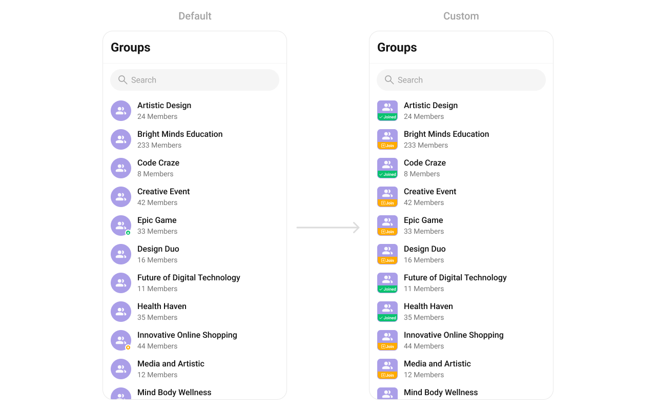
What this does: Registers aGroupsViewHolderListenerthat provides a custom view for the leading (left) area of each group item.createViewinflates your layout, andbindViewpopulates it with group data.
custom_leading_avatar_view.xml custom layout file to inflate in setLeadingView():
custom_leading_avatar_view.xml
What this does: Defines a custom leading view layout with a 40dp square LinearLayout that uses a drawable background to indicate group join status.
Inflate the XML and initialize the views using the group objects in setLeadingView:
- Java
- Kotlin
What this does: Inflates the custom leading view layout and sets the background drawable based on whether the group is joined (group_leading_joined) or not (group_leading_join). A long-click listener shows a toast indicating the group’s join status.
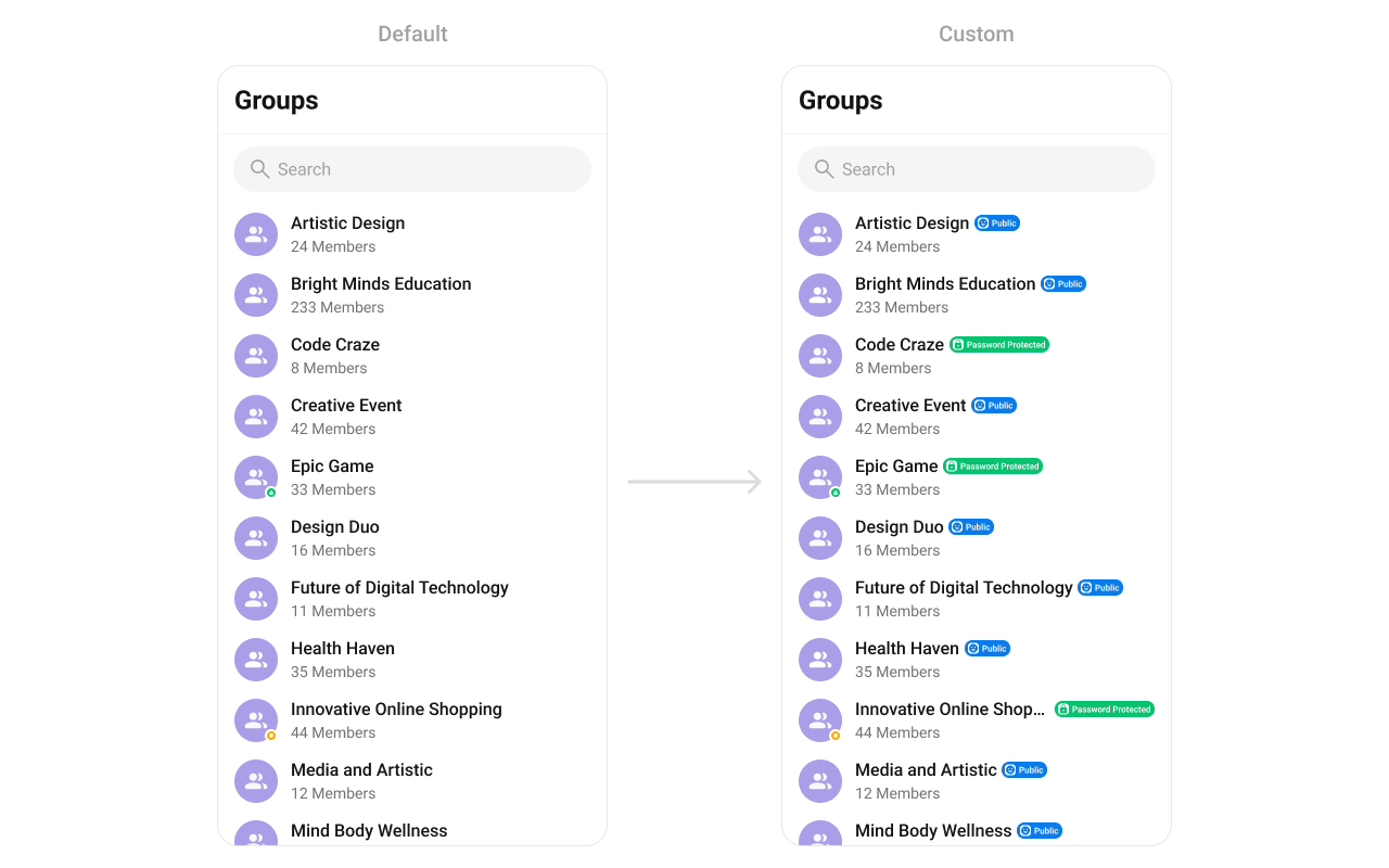
setTitleView
Customizes the title view of each group item, which displays the group name.
- Java
- Kotlin
What this does: Registers aGroupsViewHolderListenerthat provides a custom view for the title area of each group item.createViewinflates your layout, andbindViewpopulates it with group data.
custom_title_view.xml custom layout file to inflate in setTitleView():
custom_title_view.xml
What this does: Defines a custom title view layout with aInflate the XML and initialize the views using the group objects inTextViewfor the group name and aViewelement for displaying the group type indicator icon.
setTitleView:
- Java
- Kotlin
What this does: Inflates the custom title view layout, sets the group name on theTextView, and displays a group type icon based on whether the group is public, password-protected, or private usingCometChatConstants.GROUP_TYPE_PUBLIC,CometChatConstants.GROUP_TYPE_PASSWORD, andCometChatConstants.GROUP_TYPE_PRIVATE.
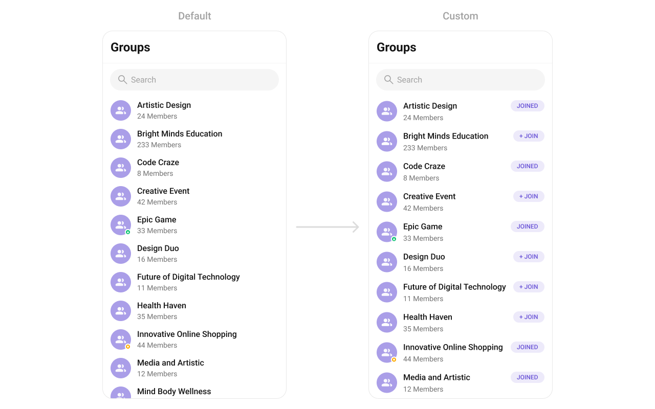
setTrailingView
Allows custom elements to be added at the end of each group item, such as buttons or indicators.
- Java
- Kotlin
What this does: Registers aGroupsViewHolderListenerthat provides a custom view for the trailing (right) area of each group item.createViewinflates your layout, andbindViewpopulates it with group data.
custom_tail_view.xml custom layout file to inflate in setTrailingView():
custom_tail_view.xml
What this does: Defines a custom trailing view layout with a MaterialButton styled as a purple “joined” badge with rounded corners.
Inflate the XML and initialize the views using the group objects in setTrailingView:
- Java
- Kotlin
What this does: Inflates the custom trailing view layout and sets the button text to “Joined” if the user has joined the group, or ”+ Join” if the user has not joined.
setItemView
Assigns a fully custom ListItem layout to the Groups component, replacing the default design.
- Java
- Kotlin
What this does: Registers aGroupsViewHolderListenerthat replaces the entire default group list item layout.createViewinflates your custom layout, andbindViewpopulates it with group data.

custom_group_list_itemd.xml custom layout file to inflate in setItemView():
custom_group_list_itemd.xml
What this does: Defines a custom list item layout with a group nameInflate the XML and initialize the views using the group objects inTextView, a “JOIN” badge in aMaterialCardView, and a subtitleTextViewfor displaying member count and description.
setItemView:
- Java
- Kotlin
YourActivity.java
What this does: Inflates the custom list item layout and populates it with the group name and a subtitle showing the member count (e.g., “5 members”) and group description. If the group has one member, it shows “1 member” followed by the description.
setSubTitleView
Customizes the subtitle view for each group item, which displays extra information below the group name.
- Java
- Kotlin
What this does: Registers aGroupsViewHolderListenerthat provides a custom view for the subtitle area of each group item.createViewinflates your layout, andbindViewpopulates it with group data.
setSubTitleView:
- Java
- Kotlin
YourActivity.java
What this does: Replaces the default subtitle with a custom TextView that shows the member count (e.g., “5 members”) and group description. If the group has one member, it shows “1 member” followed by the description.
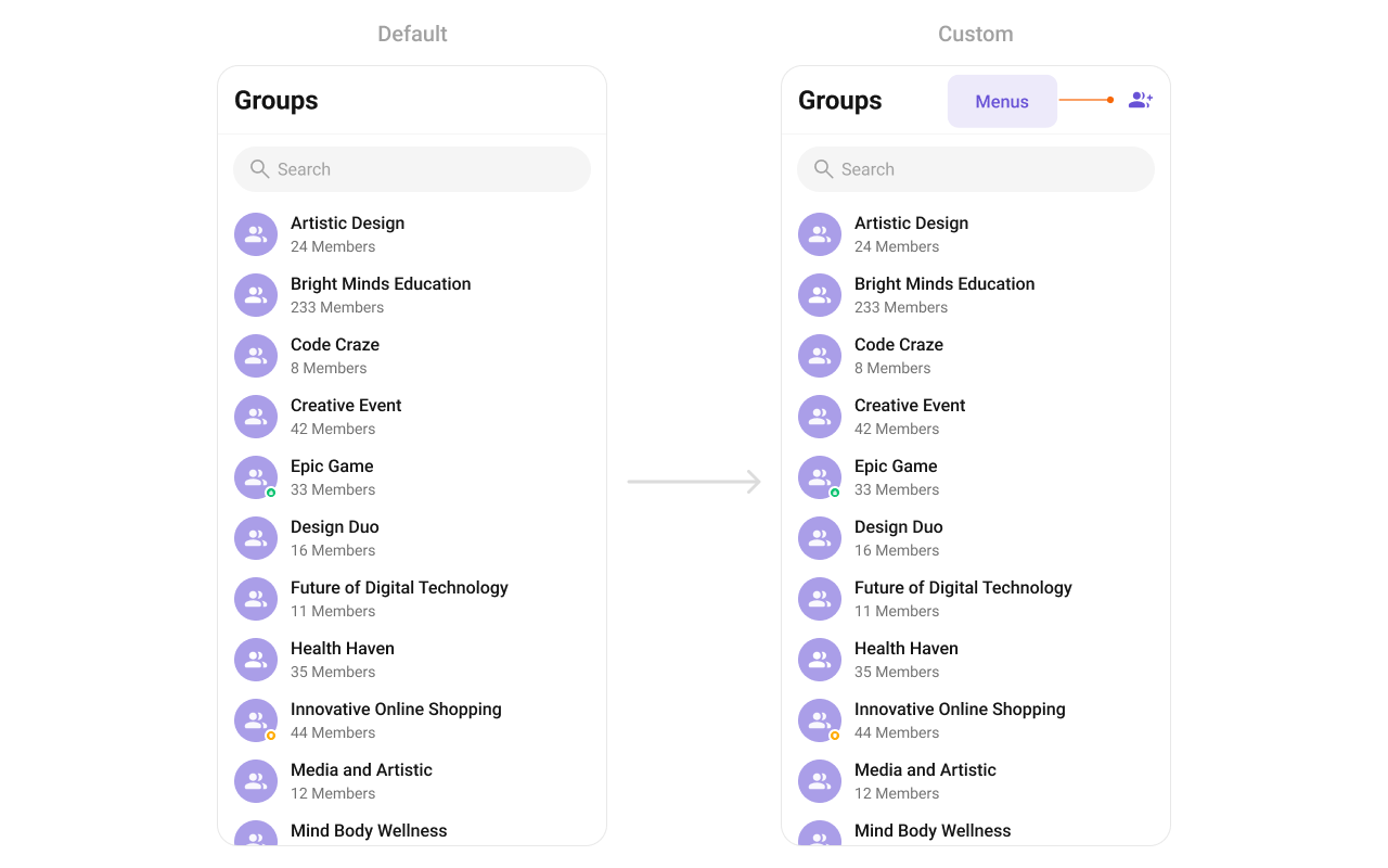
setOverflowMenu
Customizes the overflow menu (three-dot ⋮ icon) with additional options.
- Java
- Kotlin
What this does: Sets a custom View as the overflow menu in the groups toolbar. Pass any view (e.g., an icon button) to replace the default overflow menu.
overflow_menu_layout.xml custom view file to inflate and pass to setOverflowMenu:
overflow_menu_layout.xml
What this does: Defines a custom overflow menu layout with a 24dp ImageView using a “create group” icon drawable.
Inflate the view and pass it to setOverflowMenu. Get child view references to handle click actions:
- Java
- Kotlin
YourActivity.java
What this does: Inflates the custom overflow menu layout, sets a click listener on theImageViewthat shows a “Clicked on Refresh” toast, and passes the view tosetOverflowMenuto replace the default overflow menu.
- Verify: After setting any advanced view, confirm the custom view renders in the correct position within the group list item, and the data binding populates correctly for each group.
Customization matrix
| What you want to change | Where | Property/API | Example |
|---|---|---|---|
| Avatar style (corner radius, background) | themes.xml | CometChatGroupsStyle with cometchatGroupsAvatar | <item name="cometchatAvatarStrokeRadius">8dp</item> |
| Separator color | themes.xml | CometChatGroupsStyle with cometchatGroupsSeparatorColor | <item name="cometchatGroupsSeparatorColor">#F76808</item> |
| Title text color | themes.xml | CometChatGroupsStyle with cometchatGroupsTitleTextColor | <item name="cometchatGroupsTitleTextColor">#F76808</item> |
| Apply a custom style | Activity/Fragment | setStyle(int styleRes) | cometchatGroups.setStyle(R.style.CustomGroupsStyle); |
| Back button visibility | Activity/Fragment | setBackIconVisibility(int) | .setBackIconVisibility(View.VISIBLE); |
| Toolbar visibility | Activity/Fragment | setToolbarVisibility(int) | .setToolbarVisibility(View.GONE); |
| Loading state visibility | Activity/Fragment | setLoadingStateVisibility(int) | .setLoadingStateVisibility(View.GONE); |
| Error state visibility | Activity/Fragment | setErrorStateVisibility(int) | .setErrorStateVisibility(View.GONE); |
| Empty state visibility | Activity/Fragment | setEmptyStateVisibility(int) | .setEmptyStateVisibility(View.GONE); |
| Separator visibility | Activity/Fragment | setSeparatorVisibility(int) | .setSeparatorVisibility(View.GONE); |
| Group type indicator visibility | Activity/Fragment | setGroupTypeVisibility(int) | .setGroupTypeVisibility(View.GONE); |
| Search box visibility | Activity/Fragment | setSearchBoxVisibility(int) | .setSearchBoxVisibility(View.GONE); |
| Selection mode (single/multiple) | Activity/Fragment | setSelectionMode(SelectionMode) | .setSelectionMode(UIKitConstants.SelectionMode.MULTIPLE); |
| Search keyword filter | Activity/Fragment | setSearchkeyword(String) | .setSearchkeyword("anything"); |
| Filter groups (joined only, limit, tags) | Activity/Fragment | setGroupsRequestBuilder(GroupsRequestBuilder) | See Filters code above |
| Search request builder | Activity/Fragment | setSearchRequestBuilder(GroupsRequestBuilder) | See SearchRequestBuilder code above |
| Long-press options (replace) | Activity/Fragment | setOptions(Function2) | See setOptions code above |
| Long-press options (append) | Activity/Fragment | addOptions(Function2) | See addOptions code above |
| Loading view | Activity/Fragment | setLoadingView(int) | cometchatGroups.setLoadingView(R.layout.your_loading_view); |
| Empty view | Activity/Fragment | setEmptyView(int) | cometchatGroups.setEmptyView(R.layout.your_empty_view); |
| Error view | Activity/Fragment | setErrorView(int) | cometchatGroups.setErrorView(R.layout.your_empty_view); |
| Leading view (avatar area) | Activity/Fragment | setLeadingView(GroupsViewHolderListener) | See setLeadingView code above |
| Title view | Activity/Fragment | setTitleView(GroupsViewHolderListener) | See setTitleView code above |
| Trailing view | Activity/Fragment | setTrailingView(GroupsViewHolderListener) | See setTrailingView code above |
| Entire list item | Activity/Fragment | setItemView(GroupsViewHolderListener) | See setItemView code above |
| Subtitle view | Activity/Fragment | setSubTitleView(GroupsViewHolderListener) | See setSubTitleView code above |
| Overflow menu | Activity/Fragment | setOverflowMenu(View) | cometchatGroups.setOverflowMenu(View v); |
Common pitfalls & fixes
| Pitfall | Fix |
|---|---|
| Component does not render | Ensure CometChatUIKit.init() is called and awaited before using any UI Kit component. If init() has not completed, the component will not load data. |
| Group list is empty despite having groups | Verify that a user is logged in with CometChatUIKit.login() before displaying the component. The component fetches groups for the logged-in user only. |
| Only joined groups appear | If you set joinedOnly(true) on the GroupsRequestBuilder, only groups the user has joined are shown. Remove joinedOnly(true) to show all groups. |
| Filters not applied | Ensure you call setGroupsRequestBuilder(builder) on the CometChatGroups instance after creating and configuring the builder. |
| Custom style not visible | Verify the style parent is CometChatGroupsStyle and that you call setStyle(R.style.YourStyle) on the component instance. |
setOnItemClick not firing | If you set setSelectionMode to MULTIPLE, item clicks may be consumed by the selection logic. Set the selection mode to NONE if you need standard click behavior. |
| Event listener not receiving events | Ensure you call CometChatGroupEvents.addGroupListener with a unique tag. If you use the same tag as another listener, the previous one is replaced. |
| Group type indicator not showing | If you called setGroupTypeVisibility(View.GONE), the group type indicator is hidden. Call setGroupTypeVisibility(View.VISIBLE) to restore it. |
Custom view returns null in createView | If createView returns null, the default view is used. Return a valid inflated View to replace the default. |
| Search not working | If you set a SearchRequestBuilder with setSearchRequestBuilder, ensure the builder is configured with setSearchKeyWord. If the search keyword is empty, all groups are returned. |
FAQ
Q: How do I show only joined groups? A: Create aGroupsRequest.GroupsRequestBuilder, call joinedOnly(true), and pass it to setGroupsRequestBuilder.
Q: How do I listen for group creation or deletion events outside the component?
A: Use CometChatGroupEvents.addGroupListener("YOUR_TAG", ...) and override ccGroupCreated or ccGroupDeleted. Call CometChatGroupEvents.removeListeners() to unsubscribe.
Q: How do I customize the avatar and separator styles?
A: Define custom styles with parents CometChatAvatarStyle and CometChatGroupsStyle in themes.xml, reference the avatar style in cometchatGroupsAvatar, and apply with setStyle().
Q: How do I add custom long-press options without removing the defaults?
A: Use addOptions instead of setOptions. addOptions appends your custom MenuItem objects to the existing default options.
Q: How do I replace the entire group list item layout?
A: Use setItemView with a GroupsViewHolderListener. Inflate your custom layout in createView and populate it with group data in bindView.