CometChatMessageHeader displays User or Group details in the toolbar, including a typing indicator and a back navigation button.
When to use this
- You need a header bar that shows the name, avatar, and status of the user or group in a chat screen.
- You want to display a typing indicator when the other party is typing.
- You need back navigation from the message screen to the previous screen.
- You want to show voice and video call buttons in the header.
- You want to replace default header elements (subtitle, leading view, trailing view) with custom layouts.
Prerequisites
- CometChat SDK initialized with
CometChatUIKit.init()and a user logged in. - The
cometchat-chat-uikit-androiddependency added to your project. - A valid
UserorGroupobject to pass to the component. - A layout XML file or Activity/Fragment where you will place the component.
Quick start
- Open your layout XML file (e.g.,
your_layout.xml). - Add the
CometChatMessageHeaderXML element:
your_layout.xml
What this does: Adds the CometChatMessageHeader component to your layout with a fixed height of 56dp. It fills the available width and renders the header bar.
- In your Activity or Fragment, get a reference to the component and set a
UserorGroupobject:
YourActivity.java
What this does: Passes a User object to the header so it displays that user’s name, avatar, and status.
- Build and run your app.
- Verify that the header displays the user or group name, avatar, and status information.

Core concepts
CometChatMessageHeader: The main component class that renders user or group details in a toolbar. It is added via XML layout.- Actions: Callbacks such as
setOnBackPressListenerandsetOnErrorthat let you respond to user interactions. - Filters: The
MessageHeadercomponent does not expose any filters. - Events: The
MessageHeadercomponent does not produce any events. - Style: XML theme styles (parent
CometChatMessageHeaderStyle) applied viasetStyle()to customize colors, fonts, and sub-component styles. - Advanced views: Methods like
setLeadingView,setSubtitleView,setTrailingView,setItemView, andsetAuxiliaryButtonViewthat let you replace default UI elements with custom layouts.
Implementation
Actions
What you’re changing: How the component responds to user interactions such as back-press and errors.- Where: Activity or Fragment where you hold a reference to
CometChatMessageHeader(e.g.,cometchatMessageHeader). - Applies to:
CometChatMessageHeader. - Default behavior: Predefined actions execute automatically (e.g., pressing back navigates to the previous activity).
- Override: Call the corresponding setter method to replace the default behavior with your own logic.
setOnError
Listens for any errors that occur in the component. This does not change the component’s behavior.
- Java
- Kotlin
YourActivity.java
What this does: Registers an error listener. If the component encounters an error, your callback receives the CometChatException.
setOnBackPressListener
Triggered when the user presses the back button in the app bar. By default, it navigates to the previous activity.
- Java
- Kotlin
YourActivity.java
What this does: Overrides the default back-press navigation. When the user taps the back button, your custom logic runs instead.
- Verify: After setting an action callback, trigger the corresponding user interaction (back-press) and confirm your custom logic executes instead of the default behavior.
Style
What you’re changing: The visual appearance of the Message Header component using XML theme styles.- Where:
themes.xmlfor style definitions, and your Activity/Fragment for applying the style. - Applies to:
CometChatMessageHeader. - Default behavior: The component uses the default
CometChatMessageHeaderStyle. - Override: Define a custom style with parent
CometChatMessageHeaderStyleinthemes.xml, then callsetStyle()on the component.
- Code:
themes.xml
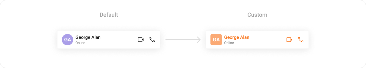
What this does: Defines two custom styles:CustomCallButtonStylesets the video and voice call icon tints to#F76808;CustomMessageHeaderStylesets the title text color to#F76808and applies custom avatar and call button sub-styles to the message header component.
- Java
- Kotlin
What this does: Applies theTo know more such attributes, visit the attributes file.CustomMessageHeaderStyletheme to theCometChatMessageHeadercomponent, changing the title text color, avatar style, and call button icon tints.
- Verify: The header title text displays in orange (
#F76808), and the voice and video call icons display with orange tint (#F76808).
Functionality
What you’re changing: Small functional customizations such as toggling visibility of UI elements and setting the user or group object.- Where: Activity or Fragment where you hold a reference to
CometChatMessageHeader. - Applies to:
CometChatMessageHeader. - Default behavior: All UI elements are visible with default settings.
- Override: Call the corresponding method on the component instance.
| Methods | Description | Code |
|---|---|---|
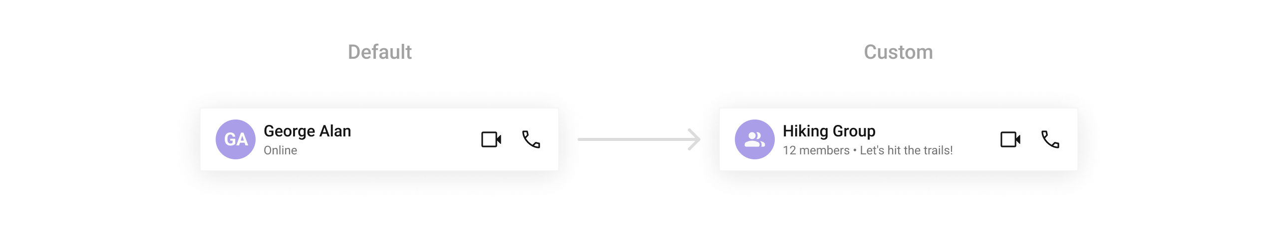
setUser | Passes a user object to display that user’s header details. This is a required property for the component to function. | .setUser(user) |
setGroup | Passes a group object to display that group’s header details. This is a required property for the component to function. | .setGroup(Group) |
setBackButtonVisibility | Toggles visibility for the back button | .setBackButtonVisibility(View.GONE) |
setUserStatusVisibility | Toggles visibility for the user’s online/offline status | .setUserStatusVisibility(View.VISIBLE) |
setVideoCallButtonVisibility | Toggles visibility for the video call button | .setVideoCallButtonVisibility(View.VISIBLE) |
setVoiceCallButtonVisibility | Toggles visibility for the voice call button | .setVoiceCallButtonVisibility(View.VISIBLE) |
- Verify: After calling a visibility method, confirm the corresponding UI element is shown or hidden. After calling
setUser(user), confirm the header displays that user’s name and avatar.
Advanced views
What you’re changing: The default UI elements of the message header, including date formatting, auxiliary buttons, menu options, the entire header layout, subtitle, leading view, and trailing view.- Where: Activity or Fragment where you hold a reference to
CometChatMessageHeader. - Applies to:
CometChatMessageHeader. - Default behavior: The component renders its built-in views for each part of the header.
- Override: Call the corresponding setter method and provide a custom view or callback.
setDateTimeFormatter
Provides a custom implementation of DateTimeFormatterCallback to configure how time and date values are displayed. Each method corresponds to a specific case:
time(long timestamp)— Custom full timestamp formattoday(long timestamp)— Called when a message is from todayyesterday(long timestamp)— Called for yesterday’s messageslastWeek(long timestamp)— Messages from the past weekotherDays(long timestamp)— Older messagesminute(long timestamp)/hour(long timestamp)— Exact time unitminutes(long diffInMinutesFromNow, long timestamp)— e.g., “5 minutes ago”hours(long diffInHourFromNow, long timestamp)— e.g., “2 hours ago”
- Java
- Kotlin
What this does: Overrides the default date/time formatting for the message header. Today’s messages show “Today”, yesterday’s show “Yesterday”, recent messages show “X mins ago” or “X hrs ago”, last week’s show “Last Week”, and older messages show the full date in “dd MMM yyyy” format.
setAuxiliaryButtonView
Allows adding a custom button or additional action next to the title or trailing section.
- Java
- Kotlin
YourActivity.java
What this does: Registers a callback that returns a customViewto display as an auxiliary button in the header. The callback receives the currentContext,User, andGroupobjects so you can customize the view based on the conversation.
setItemView
Replaces the entire default header with a fully customized layout.
- Java
- Kotlin
YourActivity.java
What this does: Registers a callback that returns a customViewto replace the entire default message header layout. The callback receives the currentContext,User, andGroupobjects.
custom_message_header.xml layout file:
custom_message_header.xml
What this does: Defines a custom message header layout with a back button, avatar, title and subtitle text views, and call buttons. This layout replaces the entire default header when inflated in setItemView.
Inflate the XML and initialize the views:
- Java
- Kotlin
What this does: Inflates the custom_message_header.xml layout and populates it with the user’s or group’s avatar, name, and status/member count. If the conversation is with a user, it sets the user’s status as the subtitle and configures call buttons for that user. If the conversation is with a group, it sets the member count as the subtitle and configures call buttons for that group.
setSubtitleView
Allows customizing the subtitle view, used for status messages or additional details.
- Java
- Kotlin
YourActivity.java
What this does: Registers a callback that returns a customViewfor the subtitle area of the header. The callback receives the currentContext,User, andGroupobjects so you can customize the subtitle based on the conversation.
- Java
- Kotlin
YourActivity.java
What this does: Creates a TextView and sets its text to the user’s status (for user conversations) or the group’s member count and description (for group conversations). If the group has more than 1 member, it shows “X members”; otherwise it shows “1 member • [description]”.
setLeadingView
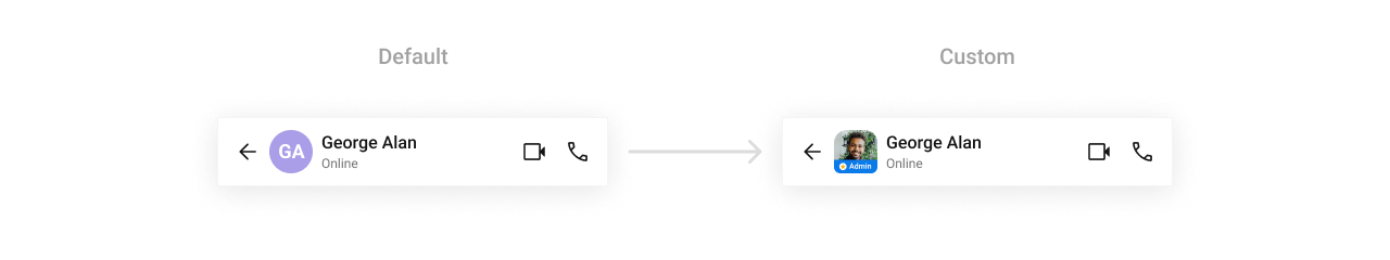
Defines a custom leading view, used for the receiver’s profile picture or avatar.
- Java
- Kotlin
YourActivity.java
What this does: Registers a callback that returns a customViewfor the leading (left) area of the header. The callback receives the currentContext,User, andGroupobjects.
header_leading_view.xml layout file:
What this does: Defines a custom leading view layout with a CometChatAvatar and a hidden admin badge view. The badge becomes visible when the user has an “admin” role or the group owner matches the logged-in user.
Inflate the XML and initialize the views:
- Java
- Kotlin
What this does: Inflates the header_leading_view.xml layout and sets the avatar image from the user or group. If the user has an “admin” role, or if the logged-in user is the group owner, the admin badge view becomes visible. The view is sized to 45dp × 45dp.
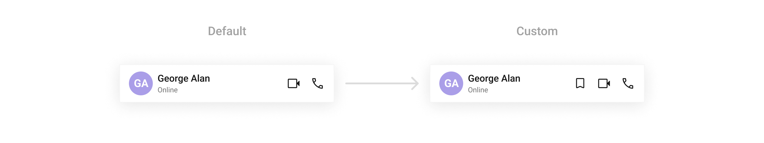
setTrailingView
Customizes the trailing (end) view of the header, used for action buttons or indicators.
- Java
- Kotlin
YourActivity.java
What this does: Registers a callback that returns a customViewfor the trailing (right) area of the header. The callback receives the currentContext,User, andGroupobjects.
- Java
- Kotlin
What this does: Creates an ImageView with a save icon drawable, sizes it to 24dp × 24dp with a 16dp left margin, and returns it as the trailing view in the header.
- Verify: After setting any advanced view, confirm the custom view renders in the correct position within the message header, and the data binding populates correctly for the user or group.
Customization matrix
| What you want to change | Where | Property/API | Example |
|---|---|---|---|
| Title text color | themes.xml | CometChatMessageHeaderStyle with cometchatMessageHeaderTitleTextColor | <item name="cometchatMessageHeaderTitleTextColor">#F76808</item> |
| Avatar style | themes.xml | CometChatMessageHeaderStyle with cometchatMessageHeaderAvatarStyle | <item name="cometchatMessageHeaderAvatarStyle">@style/CustomAvatarStyle</item> |
| Call button icon tints | themes.xml | CometChatCallButtonsStyle with cometchatCallButtonsVideoCallIconTint / cometchatCallButtonsVoiceCallIconTint | <item name="cometchatCallButtonsVideoCallIconTint">#F76808</item> |
| Apply a custom style | Activity/Fragment | setStyle(int styleRes) | cometchatMessageHeader.setStyle(R.style.CustomMessageHeaderStyle); |
| User object | Activity/Fragment | setUser(User) | .setUser(user) |
| Group object | Activity/Fragment | setGroup(Group) | .setGroup(Group) |
| Back button visibility | Activity/Fragment | setBackButtonVisibility(int) | .setBackButtonVisibility(View.GONE) |
| User status visibility | Activity/Fragment | setUserStatusVisibility(int) | .setUserStatusVisibility(View.VISIBLE) |
| Video call button visibility | Activity/Fragment | setVideoCallButtonVisibility(int) | .setVideoCallButtonVisibility(View.VISIBLE) |
| Voice call button visibility | Activity/Fragment | setVoiceCallButtonVisibility(int) | .setVoiceCallButtonVisibility(View.VISIBLE) |
| Date/time formatting | Activity/Fragment | setDateTimeFormatter(DateTimeFormatterCallback) | See setDateTimeFormatter code above |
| Auxiliary button view | Activity/Fragment | setAuxiliaryButtonView(Function3) | See setAuxiliaryButtonView code above |
| Entire header layout | Activity/Fragment | setItemView(Function3) | See setItemView code above |
| Subtitle view | Activity/Fragment | setSubtitleView(Function3) | See setSubtitleView code above |
| Leading view (avatar area) | Activity/Fragment | setLeadingView(Function3) | See setLeadingView code above |
| Trailing view | Activity/Fragment | setTrailingView(Function3) | See setTrailingView code above |
Common pitfalls & fixes
| Pitfall | Fix |
|---|---|
| Component does not render | Ensure CometChatUIKit.init() is called and awaited before using any UI Kit component. If init() has not completed, the component will not load data. |
| Header shows no user or group details | Ensure you call setUser(user) or setGroup(group) on the CometChatMessageHeader instance. The component requires one of these to display header details. |
| Back button not visible | Call setBackButtonVisibility(View.VISIBLE) on the component instance. The back button visibility may default to hidden depending on your layout. |
| Custom style not applied | Verify the style parent is CometChatMessageHeaderStyle and that you call setStyle(R.style.YourStyle) on the component instance. |
| Call buttons not visible | Ensure setVideoCallButtonVisibility(View.VISIBLE) and setVoiceCallButtonVisibility(View.VISIBLE) are called. If the calling feature is not enabled, the buttons may not appear. |
setOnBackPressListener not firing | Ensure the back button is visible by calling setBackButtonVisibility(View.VISIBLE). If the back button is hidden, the listener will not trigger. |
| Custom subtitle view not rendering | Ensure your setSubtitleView callback returns a valid View object. If the callback returns null, the default subtitle is used. |
FAQ
Q: Do I need to pass both a User and a Group object? A: No. Pass either aUser object using setUser(user) or a Group object using setGroup(group). The component displays details for whichever object is set.
Q: How do I customize the call button icons in the header?
A: Define a custom style with parent CometChatCallButtonsStyle in themes.xml, set cometchatCallButtonsVideoCallIconTint and cometchatCallButtonsVoiceCallIconTint, then reference it in your CometChatMessageHeaderStyle using cometchatMessageHeaderCallButtonsStyle.
Q: Can I replace the entire header layout?
A: Yes. Use setItemView to provide a Function3<Context, User, Group, View> callback that returns your custom layout. This replaces the entire default header.
Q: Does the MessageHeader component emit any events?
A: No. The MessageHeader component does not produce any events. Use action callbacks (setOnBackPressListener) to respond to user interactions.