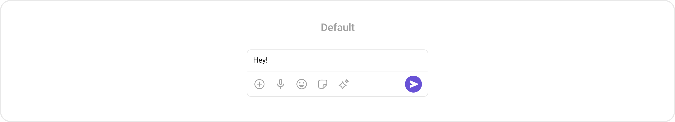
CometChatMessageComposer enables users to write and send a variety of messages, including text, image, video, and custom messages. It supports features such as live reactions, attachments, and message editing.
When to use this
- You need a message input area where users can type and send text messages.
- You want to support sending image, video, audio, and file attachments.
- You need live reaction and sticker functionality in the composer.
- You want to customize attachment options, send button, or auxiliary buttons.
- You need text formatting support such as mentions in the composer.
- You want to listen for text changes or override the send button behavior.
Prerequisites
- CometChat SDK initialized with
CometChatUIKit.init()and a user logged in. - The
cometchat-chat-uikit-androiddependency added to your project. - A valid layout XML file or Activity/Fragment where you will place the component.
Quick start
- Open your layout XML file (e.g.,
layout_activity.xml). - Add the
CometChatMessageComposerXML element:
layout_activity.xml
What this does: Adds the CometChatMessageComposer component to your layout. It fills the available width and wraps its height to fit the composer UI.
- Build and run your app.
- Verify that the message composer appears with a text input field, attachment button, and send button.
- Set the
UserorGroupobject on the composer so it knows which conversation to send messages to:
- Java
- Kotlin
What this does: Associates the composer with a specificUserobject so that messages are sent to that user’s conversation. If you are in a group conversation, use.setGroup(group)instead.
Core concepts
CometChatMessageComposer: The main component class that renders the message input area with send, attachment, and auxiliary buttons. Add it via XML layout.- Actions: Callbacks such as
setOnSendButtonClick,setOnError, andsetOnTextChangedListenerthat let you respond to user interactions in the composer. - Filters: The MessageComposer component does not have any available filters.
- Events: The MessageComposer component does not emit any events of its own.
- Style: XML theme styles (parent
CometChatMessageComposerStyle) applied viasetStyle()to customize colors, icons, and tints. - Functionality: Methods like
setUser,setGroup,disableTypingEvents,setAttachmentButtonVisibility, and others that control composer behavior. - Advanced views: Methods like
setTextFormatters,setAttachmentOptions,setAuxiliaryButtonView,setSendButtonView, andsetHeaderViewthat let you replace default UI elements with custom layouts.
Implementation
Actions
What you’re changing: How the component responds to user interactions such as tapping the send button, encountering errors, and text input changes.- Where: Activity or Fragment where you hold a reference to
CometChatMessageComposer(e.g.,messageComposer). - Applies to:
CometChatMessageComposer. - Default behavior: The send button sends the composed message. Errors are handled internally. Text changes are not externally observed.
- Override: Call the corresponding setter method to replace the default behavior with your own logic.
setOnSendButtonClick
The OnSendButtonClick event gets activated when the send message button is clicked. It has a predefined function of sending messages entered in the composer EditText. You can override this action with the following code snippet.
- Java
- Kotlin
What this does: Replaces the default send-button behavior. When a user taps the send button, your custom lambda executes instead of the built-in message sending logic.
setOnError
This action does not change the behavior of the component but listens for any errors that occur in the MessageComposer component.
- Java
- Kotlin
YourActivity.java
What this does: Registers an error listener. If the component encounters an error, your callback receives the CometChatException.
setOnTextChangedListener
Function triggered whenever the message input’s text value changes, enabling dynamic text handling.
- Java
- Kotlin
YourActivity.java
What this does: Registers aCometChatTextWatcherthat fires callbacks when the text in the composer input field changes. UseonTextChangedfor real-time character tracking,beforeTextChangedfor pre-change state, andafterTextChangedfor post-change processing.
- Verify: After setting an action callback, trigger the corresponding user interaction (tap send, type text) and confirm your custom logic executes instead of the default behavior.
Filters
The MessageComposer component does not have any available filters.Events
The MessageComposer component does not emit any events of its own.Style
What you’re changing: The visual appearance of the MessageComposer component using XML theme styles.- Where:
themes.xmlfor style definitions, and your Activity/Fragment for applying the style. - Applies to:
CometChatMessageComposer. - Default behavior: The component uses the default
CometChatMessageComposerStyle. - Override: Define a custom style with parent
CometChatMessageComposerStyleinthemes.xml, then callsetStyle()on the component.

- Code:
What this does: Defines a custom vector drawable for the active send button with an orange circular background and a white send arrow icon.Then define the custom style in
themes.xml:
What this does: Defines a custom style that tints the attachment icon, voice recording icon, sticker icons, and AI icon to orange (#F76808), and replaces the active send button drawable with the custom vector defined above.
Apply the style to the component:
- Java
- Kotlin
What this does: Applies theTo know more such attributes, visit the attributes file.CustomMessageComposerStyletheme to theCometChatMessageComposercomponent, changing the icon tints and send button appearance.
- Verify: The composer attachment icon, voice recording icon, sticker icons, and AI icon display in orange (
#F76808), and the active send button shows the custom orange circular drawable.
Functionality
What you’re changing: Small functional customizations such as toggling visibility of UI elements, setting custom sounds, configuring typing events, and setting predefined text.- Where: Activity or Fragment where you hold a reference to
CometChatMessageComposer. - Applies to:
CometChatMessageComposer. - Default behavior: All UI elements are visible with default settings. Typing events are enabled. No predefined text is set.
- Override: Call the corresponding method on the component instance.
| Methods | Description | Code |
|---|---|---|
setUser | Used to pass user object of which header specific details will be shown | .setUser(user) |
setGroup | Used to pass group object of which header specific details will be shown | .setGroup(Group) |
disableTypingEvents | Used to disable/enable typing events, default false | .disableTypingEvents(boolean) |
disableSoundForMessages | Used to toggle sound for outgoing messages | .disableSoundForMessages(boolean) |
setInitialComposerText | Used to set predefined text | .setInitialComposerText("Your_Text") |
setMaxLine | Maximum lines allowed to increase in the input field | .setMaxLine(int) |
setAuxiliaryButtonAlignment | Controls position of auxiliary button view, can be left or right. Default right | .setAuxiliaryButtonAlignment(AuxiliaryButtonsAlignment) |
setDisableMentions | Sets whether mentions in text should be disabled. If set to true, it removes any formatters that are instances of CometChatMentionsFormatter | .setDisableMentions(true); |
setCustomSoundForMessages | Used to give custom sounds to outgoing messages | .setCustomSoundForMessages(String) |
setAttachmentButtonVisibility | Hides the attachment button in the composer | .setAttachmentButtonVisibility(View.VISIBLE) |
setStickersButtonVisibility | Hides the stickers button in the composer | .setStickersButtonVisibility(View.GONE) |
setSendButtonVisibility | Hides the send button in the composer | .setSendButtonVisibility(View.VISIBLE) |
setCameraAttachmentOptionVisibility | Controls whether camera attachments are allowed | .setCameraAttachmentOptionVisibility(View.VISIBLE) |
setImageAttachmentOptionVisibility | Controls whether image attachments are allowed | .setImageAttachmentOptionVisibility(View.VISIBLE) |
setVideoAttachmentOptionVisibility | Controls whether video attachments are allowed | .setVideoAttachmentOptionVisibility(View.VISIBLE) |
setAudioAttachmentOptionVisibility | Controls whether audio attachments are allowed | .setAudioAttachmentOptionVisibility(View.VISIBLE) |
setFileAttachmentOptionVisibility | Controls whether file attachments are allowed | .setFileAttachmentOptionVisibility(View.VISIBLE) |
setPollAttachmentOptionVisibility | Controls whether polls can be shared | .setPollAttachmentOptionVisibility(View.VISIBLE) |
setCollaborativeDocumentOptionVisibility | Controls whether collaborative documents can be shared | .setCollaborativeDocumentOptionVisibility(View.VISIBLE) |
setCollaborativeWhiteboardOptionVisibility | Controls whether collaborative whiteboards can be shared | .setCollaborativeWhiteboardOptionVisibility(View.VISIBLE) |
- Verify: After calling a visibility method, confirm the corresponding UI element is shown or hidden. After calling
disableTypingEvents(true), confirm no typing indicators are sent. After callingsetInitialComposerText("Your_Text"), confirm the text input field shows the predefined text.
Advanced views
What you’re changing: The default UI elements of the composer including text formatters, attachment options, auxiliary buttons, send button, and header view.- Where: Activity or Fragment where you hold a reference to
CometChatMessageComposer. - Applies to:
CometChatMessageComposer. - Default behavior: The component renders its built-in views for each part of the composer.
- Override: Call the corresponding setter method and provide a custom view or callback.
setTextFormatters
Assigns the list of text formatters. If the provided list is not null, it sets the list. Otherwise, it assigns the default text formatters retrieved from the data source. To configure the existing Mentions look and feel check out CometChatMentionsFormatter.

themes.xml
What this does: Defines a custom mentions style with black text and background for regular mentions, and green (#30A46C) text and background for self-mentions, both using the body regular text appearance.
- Java
- Kotlin
What this does: Creates aCometChatMentionsFormatter, applies the custom mentions style to it, adds it to a list of text formatters, and sets that list on theCometChatMessageComposer. Mentions in the composer input will render with the custom colors and text appearance.
setAttachmentOptions
By using setAttachmentOptions(), you can set a list of custom CometChatMessageComposerAction for the MessageComposer component. This replaces the existing list of attachment options.
- Java
- Kotlin
What this does: CallssetAttachmentOptions()to replace the default attachment options. Pass a list ofCometChatMessageComposerActionobjects to define custom attachment actions.

- Java
- Kotlin
What this does: Creates four customCometChatMessageComposerActionobjects, each with a title, icon, and click handler that shows a toast. The list is passed tosetAttachmentOptions(), replacing the default attachment options (camera, image, video, audio, file, poll, etc.) with these four custom actions.
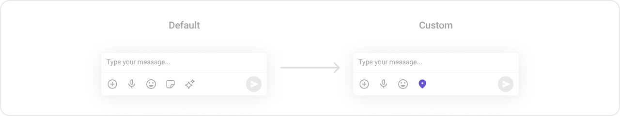
setAuxiliaryButtonView
You can insert a custom view into the MessageComposer component to add additional functionality using this method.
Note: The MessageComposer component uses the AuxiliaryButton to provide sticker functionality. If you override the AuxiliaryButton, it replaces the sticker functionality.
- Java
- Kotlin
What this does: CallssetAuxiliaryButtonView()to replace the default auxiliary button area. Pass a customViewto define your own auxiliary button content.
.setAuxiliaryButtonView():
- Java
- Kotlin
What this does: Creates a horizontalLinearLayoutcontaining the default auxiliary buttons (retrieved viaCometChatUIKit.getDataSource().getAuxiliaryOption()) and a customImageViewwith a save icon. The combined layout replaces the default auxiliary button area, preserving the existing sticker/AI buttons while adding a custom button.
setSendButtonView
You can set a custom view in place of the already existing send button view using this method.
- Java
- Kotlin
What this does: Replaces the default send button with your custom View. The custom view takes over the send button position in the composer.

drawable/custom_send_button.xml
What this does: Defines a custom vector drawable for the send button with a light purple rounded-rectangle background and a purple send arrow icon.Then create an
ImageView with the custom drawable and set it as the send button:
- Java
- Kotlin
What this does: Creates an ImageView with the custom send button drawable, attaches a click listener that shows a toast, and sets it as the send button view on the composer. The custom button replaces the default send button.
setHeaderView
You can set a custom header view to the MessageComposer component using this method. The header view appears above the text input area.
- Java
- Kotlin
What this does: Sets a custom View as the header of the composer. The header view renders above the text input area.

.setHeaderView():
custom_header_layout
What this does: Defines a custom header layout with aMaterialCardViewcontaining an icon and “Notes” text label. The card has a light purple background (#EDEAFA) with rounded corners.
- Java
- Kotlin
What this does: Inflates the custom header layout XML and sets it as the header view on the composer. The “Notes” card appears above the text input area.
- Verify: After setting any advanced view, confirm the custom view renders in the correct position within the composer, and the data binding populates correctly.
Customization matrix
| What you want to change | Where | Property/API | Example |
|---|---|---|---|
| Attachment icon tint | themes.xml | CometChatMessageComposerStyle with cometchatMessageComposerAttachmentIconTint | <item name="cometchatMessageComposerAttachmentIconTint">#F76808</item> |
| Voice recording icon tint | themes.xml | CometChatMessageComposerStyle with cometchatMessageComposerVoiceRecordingIconTint | <item name="cometchatMessageComposerVoiceRecordingIconTint">#F76808</item> |
| Active sticker icon tint | themes.xml | CometChatMessageComposerStyle with cometchatMessageComposerActiveStickerIconTint | <item name="cometchatMessageComposerActiveStickerIconTint">#F76808</item> |
| Inactive sticker icon tint | themes.xml | CometChatMessageComposerStyle with cometchatMessageComposerInactiveStickerIconTint | <item name="cometchatMessageComposerInactiveStickerIconTint">#F76808</item> |
| AI icon tint | themes.xml | CometChatMessageComposerStyle with cometchatMessageComposerAIIconTint | <item name="cometchatMessageComposerAIIconTint">#F76808</item> |
| Active send button drawable | themes.xml | CometChatMessageComposerStyle with cometchatMessageComposerActiveSendButtonDrawable | <item name="cometchatMessageComposerActiveSendButtonDrawable">@drawable/active_send_button</item> |
| Apply a custom style | Activity/Fragment | setStyle(int styleRes) | cometChatMessageComposer.setStyle(R.style.CustomMessageComposerStyle); |
| Target user | Activity/Fragment | setUser(User) | .setUser(user) |
| Target group | Activity/Fragment | setGroup(Group) | .setGroup(Group) |
| Typing events | Activity/Fragment | disableTypingEvents(boolean) | .disableTypingEvents(true) |
| Outgoing message sound | Activity/Fragment | disableSoundForMessages(boolean) | .disableSoundForMessages(true) |
| Predefined text | Activity/Fragment | setInitialComposerText(String) | .setInitialComposerText("Your_Text") |
| Max input lines | Activity/Fragment | setMaxLine(int) | .setMaxLine(5) |
| Auxiliary button alignment | Activity/Fragment | setAuxiliaryButtonAlignment(AuxiliaryButtonsAlignment) | .setAuxiliaryButtonAlignment(AuxiliaryButtonsAlignment) |
| Disable mentions | Activity/Fragment | setDisableMentions(boolean) | .setDisableMentions(true); |
| Custom outgoing message sound | Activity/Fragment | setCustomSoundForMessages(String) | .setCustomSoundForMessages(String) |
| Attachment button visibility | Activity/Fragment | setAttachmentButtonVisibility(int) | .setAttachmentButtonVisibility(View.VISIBLE) |
| Stickers button visibility | Activity/Fragment | setStickersButtonVisibility(int) | .setStickersButtonVisibility(View.GONE) |
| Send button visibility | Activity/Fragment | setSendButtonVisibility(int) | .setSendButtonVisibility(View.VISIBLE) |
| Camera attachment option | Activity/Fragment | setCameraAttachmentOptionVisibility(int) | .setCameraAttachmentOptionVisibility(View.VISIBLE) |
| Image attachment option | Activity/Fragment | setImageAttachmentOptionVisibility(int) | .setImageAttachmentOptionVisibility(View.VISIBLE) |
| Video attachment option | Activity/Fragment | setVideoAttachmentOptionVisibility(int) | .setVideoAttachmentOptionVisibility(View.VISIBLE) |
| Audio attachment option | Activity/Fragment | setAudioAttachmentOptionVisibility(int) | .setAudioAttachmentOptionVisibility(View.VISIBLE) |
| File attachment option | Activity/Fragment | setFileAttachmentOptionVisibility(int) | .setFileAttachmentOptionVisibility(View.VISIBLE) |
| Poll attachment option | Activity/Fragment | setPollAttachmentOptionVisibility(int) | .setPollAttachmentOptionVisibility(View.VISIBLE) |
| Collaborative document option | Activity/Fragment | setCollaborativeDocumentOptionVisibility(int) | .setCollaborativeDocumentOptionVisibility(View.VISIBLE) |
| Collaborative whiteboard option | Activity/Fragment | setCollaborativeWhiteboardOptionVisibility(int) | .setCollaborativeWhiteboardOptionVisibility(View.VISIBLE) |
| Mentions text style | themes.xml | CometChatMessageComposerMentionsStyle | <item name="cometchatMentionTextColor">#000000</item> |
| Text formatters | Activity/Fragment | setTextFormatters(List<CometChatTextFormatter>) | See setTextFormatters code above |
| Attachment options (replace) | Activity/Fragment | setAttachmentOptions(List<CometChatMessageComposerAction>) | See setAttachmentOptions code above |
| Auxiliary button view | Activity/Fragment | setAuxiliaryButtonView(View) | See setAuxiliaryButtonView code above |
| Send button view | Activity/Fragment | setSendButtonView(View) | See setSendButtonView code above |
| Header view | Activity/Fragment | setHeaderView(View) | See setHeaderView code above |
Common pitfalls & fixes
| Pitfall | Fix |
|---|---|
| Component does not render | Ensure CometChatUIKit.init() is called and awaited before using any UI Kit component. If init() has not completed, the component will not load. |
| Messages not sending to the correct conversation | Ensure you call .setUser(user) or .setGroup(group) on the CometChatMessageComposer instance to associate it with the correct conversation. |
ActivityResultLauncher not initialized | The CometChatMessageComposer manages runtime permissions. Ensure its object is created in the onCreate state of an Activity. If using a Fragment, ensure the Fragment is loaded in the onCreate state of the Activity. |
| Custom style not visible | Verify the style parent is CometChatMessageComposerStyle and that you call setStyle(R.style.YourStyle) on the component instance. |
| Sticker button disappears after setting auxiliary view | The MessageComposer uses the AuxiliaryButton for sticker functionality. If you override it with setAuxiliaryButtonView(), retrieve the default auxiliary buttons via CometChatUIKit.getDataSource().getAuxiliaryOption() and include them in your custom layout. |
| Attachment options not showing custom actions | Ensure you pass the list of CometChatMessageComposerAction objects to setAttachmentOptions(actionList). Calling setAttachmentOptions() without a list does not add custom actions. |
| Typing indicators still sent after disabling | Ensure you call disableTypingEvents(true) before the component starts loading. If called after the component is already active, it may not take effect immediately. |
setOnSendButtonClick not firing | If you set a custom send button view with setSendButtonView(), the setOnSendButtonClick callback may not fire because the custom view replaces the default send button entirely. Attach your click listener directly to the custom view instead. |
| Mentions not rendering with custom style | Ensure you create a CometChatMentionsFormatter, call setMessageComposerMentionTextStyle() with your custom style resource, and pass the formatter in a list to setTextFormatters(). |
| Predefined text not appearing | Ensure you call setInitialComposerText("Your_Text") after the component is initialized and attached to the view hierarchy. |
FAQ
Q: Does the MessageComposer support filters or events? A: No. The MessageComposer component does not have any available filters and does not emit any events of its own. Q: How do I set the target user or group for the composer? A: Call.setUser(user) for a one-on-one conversation or .setGroup(group) for a group conversation on the CometChatMessageComposer instance.
Q: How do I keep the default sticker button when adding a custom auxiliary view?
A: Retrieve the default auxiliary buttons using CometChatUIKit.getDataSource().getAuxiliaryOption(), add them to a LinearLayout along with your custom view, and pass the combined layout to setAuxiliaryButtonView().
Q: How do I customize the attachment options?
A: Create a list of CometChatMessageComposerAction objects, each with a title, icon, and click handler, and pass the list to setAttachmentOptions(actionList). This replaces the default attachment options entirely.
Q: How do I customize the mentions appearance in the composer?
A: Define a custom style with parent CometChatMessageComposerMentionsStyle in themes.xml, create a CometChatMentionsFormatter, call setMessageComposerMentionTextStyle() with your style, and pass the formatter to setTextFormatters().